Modern elections are data visualisation bonanzas, and the 2015 UK General Election is no exception.
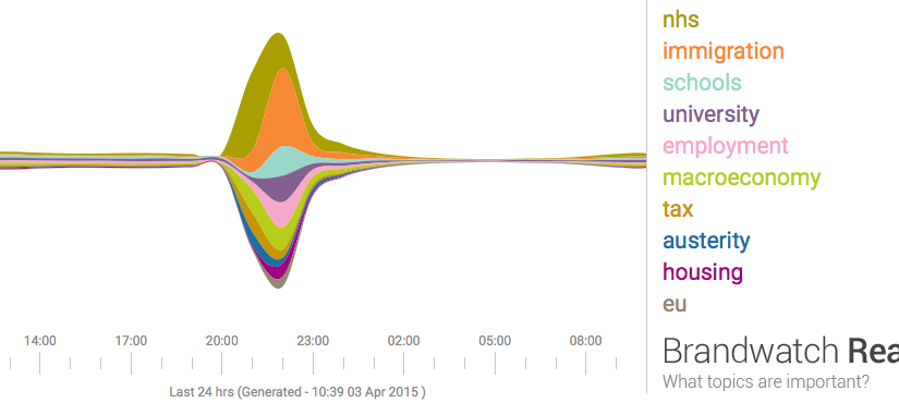
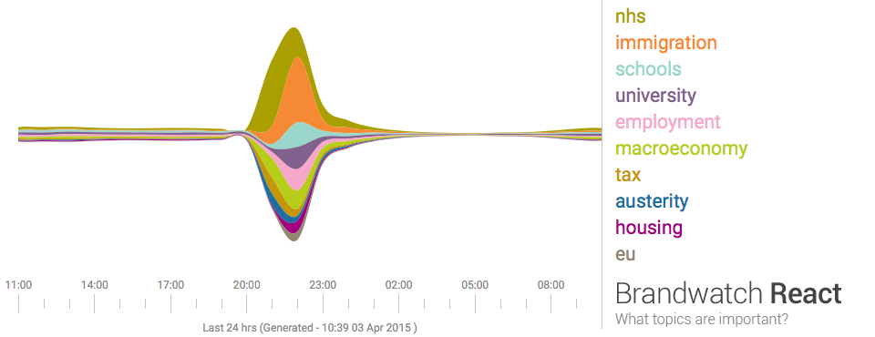
Last night seven political leaders presented their views in a televised debate. This morning the papers are full of snap polls, focus groups, body language experts, and graphs based on public social media posts describing the results. Graphs like the one below summarise masses of text using a technique called 'sentiment analysis', a form of computational language processing.* After a twitter conversation with @benosteen and @MLBrook I thought it was worth posting about the inherent biases in the tools that create these visualisations. Ultimately, 'sentiment analysis' is someone's opinion turned into code – so whose opinion are you seeing?
This is a great time to remember that sentiment analysis – mining text to see what people are talking about and how they feel about it – is based on algorithms and software libraries that were created and configured by people who've made a series of small, accumulative decisions that affect what we see. You can think of sentiment analysis as a sausage factory with the text of tweets as the mince going in one end, and pretty pictures as the product coming out the other end. A healthy democracy needs the list of secret ingredients added during processing, not least because this election prominently features spin rooms and party lines.
What are those 'ingredients'? The software used for sentiment analysis is 'trained' on existing text, and the type of text used affects what the software assumes about the world. For example, software trained on business articles is great at recognising company names but does not do so well on content taken from museum catalogues (unless the inventor of an object went on to found a company and so entered the trained vocabulary). The algorithms used to process text change the output, as does the length of the phrase analysed. The results are riddled with assumptions about tone, intent, the demographics of the poster and more.
In the case of an election, we'd also want to know when the text used for training was created, whether it looks at previous posts by the same person, and how long the software was running over the given texts. Where was the baseline of sentiment on various topics set? Who defines what 'neutral' looks like to an algorithm?
We should ask the same questions about visualisations and computational analysis that we'd ask about any document. The algorithmic 'black box' is a human construction, and just like every other text, software is written by people. Who's paying for it? What sources did they use? If it's an agency promoting their tools, do they mention the weaknesses and probable error rates or gloss over it? If it's a political party (or a company owned by someone associated with a party), have they been scrupulous in weeding out bots? Do retweets count? Are some posters weighted more heavily? Which visualisations were discarded and how did various news outlets choose the visualisations they featured? Which parties are left out?
It matters because, all software has biases, and, as Brandwatch say, 'social media will have a significant role in deciding the outcome of the general election'. And finally, as always, who's not represented in the dataset?
* If you already know this, hopefully you'll know the rest too. This post is deliberately light on technical detail but feel free to add more detailed information in the comments.
 This is a great time to remember that sentiment analysis – mining text to see what people are talking about and how they feel about it – is based on algorithms and software libraries that were created and configured by people who've made a series of small, accumulative decisions that affect what we see. You can think of sentiment analysis as a sausage factory with the text of tweets as the mince going in one end, and pretty pictures as the product coming out the other end. A healthy democracy needs the list of secret ingredients added during processing, not least because this election prominently features spin rooms and party lines.