These are a few of my favourite (audience research) things

On Friday I popped into London to give a talk at the Art of Digital meetup at the Photographer's Gallery. It's a great series of events organised by Caroline Heron and Jo Healy, so go along sometime if you can. I talked about different ways of doing audience research. (And when I wrote the line 'getting to know you' it gave me an earworm and a 'lessons from musicals' theme). It was a talk of two halves. In the first, I outlined different ways of thinking about audience research, then went into a little more detail about a few of my favourite (audience research) things.

There are lots of different ways to understand the contexts and needs different audiences bring to your offerings. You probably also want to test to see if what you're making works for them and to get a sense of what they're currently doing with your websites, apps or venues. It can help to think of research methods along scales of time, distance, numbers, 'density' and intimacy. (Or you could think of it as a journey from 'somewhere out there' to 'dancing cheek to cheek'…)

'Time' refers to both how much time a method asks from the audience and how much time it takes to analyse the results. There's no getting around the fact that nearly all methods require time to plan, prepare and pilot, sorry! You can run 5 second tests that ask remote visitors a single question, or spend months embedded in a workplace shadowing people (and more time afterwards analysing the results). On the distance scale, you can work with remote testers located anywhere across the world, ask people visiting your museum to look at a few prototype screens, or physically locate yourself in someone's office for an interview or observation.

Numbers and 'density' (or the richness of communication and the resulting data) tend to be inversely linked. Analytics or log files let you gather data from millions of website or app users, one-question surveys can garner thousands of responses, you can interview dozens of people or test prototypes with 5-8 users each time. However, the conversations you'll have in a semi-structured interview are much richer than the responses you'll get to a multiple-choice questionnaire. This is partly because it's a two-way dialogue, and partly because in-person interviews convey more information, including tone of voice, physical gestures, impressions of a location and possibly even physical artefacts or demonstrations. Generally, methods that can reach millions of remote people produce lots of point data, while more intimate methods that involve spending lots of time with just a few people produce small datasets of really rich data.

So here are few of my favourite things: analytics, one-question surveys, 5 second tests, lightweight usability tests, semi-structured interviews, and on-site observations. Ultimately, the methods you use are a balance of time and distance, the richness of the data required, and whether you want to understand the requirements for, or measure the performance of a site or tool.

Analytics are great for understanding how people found you, what they're doing on your site, and how this changes over time. Analytics can help you work out which bits of a website need tweaking, and for measuring to see the impact of changes. But that only gets you so far – how do you know which trends are meaningful and which are just noise? To understand why people are doing what they do, you need other forms of research to flesh them out. 
One question surveys are a great way of finding out why people are on your site, and whether they've succeeded in achieving their goals for being there. We linked survey answers to analytics for the last Let's Get Real project so we could see how people who were there for different reasons behaved on the site, but you don't need to go that far – any information about why people are on your site is better than none! 
5 second tests and lightweight usability tests are both ways to find out how well a design works for its intended audiences. 5 second tests show people an interface for 5 seconds, then ask them what they remember about it, or where they'd click to do a particular task. They're a good way to make sure your text and design are clear. Usability tests take from a few minutes to an hour, and are usually done in person. One of my favourite lightweight tests involves grabbing a sketch, an iPad or laptop and asking people in a café or other space if they'd help by testing a site for a few minutes. You can gather lots of feedback really quickly, and report back with a prioritised list of fixes by the end of the day. 
Semi-structured interviews use the same set of questions each time to ensure some consistency between interviews, but they're flexible enough to let you delve into detail and follow any interesting diversions that arise during the conversation. Interviews and observations can be even more informative if they're done in the space where the activities you're interested in take place. 'Contextual inquiry' goes a step further by including observations of the tasks you're interested in being performed. If you can 'apprentice' yourself to someone, it's a great way to have them explain to you why things are done the way they are. However, it's obviously a lot more difficult to find someone willing and able to let you observe them in this way, it's not appropriate for every task or research question, and the data that results can be so rich and dense with information that it takes a long time to review and analyse. 
And one final titbit of wisdom from a musical – always look on the bright side of life! Any knowledge is better than none, so if you manage to get any audience research or usability testing done then you're already better off than you were before.

[Update: a comment on twitter reminded me of another favourite research thing: if you don't yet have a site/app/campaign/whatever, test a competitor's!]
Geek for a week: residency at the Powerhouse Museum

I've spent the last week as 'geek-in-residence' with the Digital, Social and Emerging Technologies team at the Powerhouse Museum. I wasn't sure what 'geek-in-residence' would mean in reality, but in this case it turned out to be a week of creativity, interesting constraints and rapid, iterative design.

When I arrived on Monday morning, I had no idea what I'd be working on, let alone how it would all work. By the end of the first day I knew how I'd be working, but not exactly what I'd focus on. I came in with fresh questions on Tuesday, and was sketching ideas by lunchtime. The next few days were spent getting stuck into wireframes to focus in on specific issues within that problem space; I turned initial ideas into wireframes and basic copy; and put that through two rounds of quick-and-dirty testing with members of the public and Powerhouse volunteers. By the time I left on Friday I was able to handover wireframes for a site called 'conversations about collections' which aims to record people's memories of items from the collection. (I ran out of time to document the technical aspects of how the site could be built in WordPress, but given the skills of the team I think they'll cope.)

The first day and a half were about finding the right-sized problem. In conversations with Paula (Manager of the Visual & Digitisation services team) and Luke (Web Manager), we discussed what each of us were interested in exploring, looking for the intersection between what was possible in the time and with the material to hand.

After those first conversations, I went back to Powerhouse's strategy document for inspiration. If in doubt, go back to the mission! I was looking for a tie-in with their goals – luckily their plan made it easy to see where things might fit. Their strategy talked about ideas and technology that have changed our world and stories of people who create and inspire them, about being open to 'rich engagement, to new conversations about the collections'.

I also considered what could be supported by the existing API, what kinds of activities worked well with their collections and what could be usefully built and tested as paper or on-screen prototypes.  Like many large collections, most of the objects lack the types of data that supports deeper engagement for non-experts (though the significance statements that exist are lovely).

Two threads emerged from the conversations: bringing social media conversations and activity back into the online collections interfaces to help provide an information scent for users of the site; and crowdsourcing games based around enhancing the collections data.
The first was an approach to the difficulties in surfacing the interesting objects in very large collections. Could you create a 'heat map' based on online activity about objects to help searchers and browsers spot objects that might be more interesting?

At one point Nico (Senior Producer) and I had a look at Google Analytics to see what social media sites were sending traffic to the collections and suss out how much data could be gleaned. Collection objects are already showing up on Pinterest, and I had wild thoughts about screen-scraping Pinterest (they have no API) to display related boards on the OPAC search results or object pages…

I also thought about building a crowdsourcing game that would use expert knowledge to data to make better games possible for the general public – this would be an interesting challenge, as open-ended activities are harder to score automatically so you need to design meaningful rewards and ensure an audience to help provide them. However, it was probably a bigger task than I had time for, especially with most of the team already busy on other tasks, though I've been interested in that kind of dual-phased project since my MSc project on crowdsourcing games for museums.

But in the end, I went back to two questions: what information is needed about the collections, what's the best way to get it?  We decided to focus on conversations, stories and clues about objects in the collections with a site aimed at collecting 'living memories' about objects by asking people what they remember about an object and how they'd explain it to a kid.  The name, 'Conversations about collections' came directly from the strategy doc and was just too neat a description to pass up, though 'memory bank' was another contender.
I ended up with five wireframes (clickable PDF at that link) to cover the main tasks of the site: to persuade people (particularly older people) that their memories are worth sharing, and to get the right object in front of the right person.  Explaining more about the designs would be a whole other blog post, but in the interests of getting this post out I'll save that for another day… I'm dashing out this post before I head out, but I'll update in response to questions (and generally things out when I have more time).

My week at the Powerhouse was a brilliant chance to think through the differences between history of science/social history objects and art objects, and between history and art museums, but that's for another post (perhaps when if I ever get around to posting my notes from the MCN session on a similar topic).

It also helped me reflect on my interests, which I would summarise as 'meaningful audience participation' – activities that are engaging and meaningful for the audience and also add value for the museum, activities that actually change the museum in some way (hopefully for the better!), whether that's through crowdsourcing, co-curation or other types of engagement.

Finally, I owe particular thanks to Paula Bray and Luke Dearnley for running with Seb Chan's original suggestion and for their time and contributions to shaping the project; to Nicolaas Earnshaw for wireframe work and Suse Cairns for going out testing on the gallery floor with me; and to Dan Collins, Estee Wah, Geoff Barker and everyone else in the office and on various tours for welcoming me into their space and their conversations.


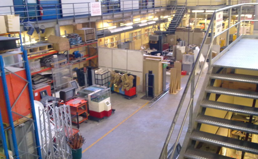
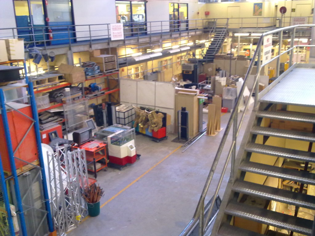
Photo: behind the scenes at the (then) Powerhouse Museum, Sydney

Usability: the key that unlocks geeky goodness

This is a quick pointer to three posts about some usability work I did for the JISC-funded Pelagios project, and a reflection on the process. Pelagios aims to 'help introduce Linked Open Data goodness into online resources that refer to places in the Ancient World'. The project has already done lots of great work with the various partners to bring lots of different data sources together, but they wanted to find out whether the various visualisations (particularly the graph explorer) let users discover the full potential of the linked data sets.

I posted on the project blog about how I worked out a testing plan to encourage user-centred design and set up the usability sessions in Evaluating Pelagios' usability, set out how a test session runs (with sample scripts and tasks) in Evaluating usability: what happens in a user testing session? and finally I posted some early Pelagios usability testing results. The results are from a very small sample of potential users but they were consistent in the issues and positive results uncovered.

The wider lesson for LOD-LAM (linked open data in library, archives, museums) projects is that user testing (and/or a strong user-centred design process) helps general audiences (including subject specialists) appreciate the full potential of a technically-led project – without thoughtful design, the results of all those hours of code may go unloved by the people they were written for. In other words, user experience design is the key that unlocks the geeky goodness that drives these projects. It's old news, but the joy of user testing is that it reminds you of what's really important…

WCAG 2.0 is coming!

That'd be the 'Web Content Accessibility Guidelines 2.0' – a 'wide range of recommendations for making Web content more accessible' with success criteria 'written as testable statements that are not technology-specific' (i.e. possibly including JavaScript or Flash as well as HTML and CSS, but the criteria are still sorted into A, AA and AAA).

Putting that in context, a blog post on webstandards.org, 'WCAG 2 and mobileOK Basic Tests specs are proposed recommendations', says:

It's possible that WCAG 2 could be the new accessibility standard by Christmas. What does that mean for you? The answer: it depends. If your approach to accessibility has been one of guidelines and ticking against checkpoints, you'll need some reworking your test plans as the priorities, checkpoints and surrounding structures have changed from WCAG 1. But if your site was developed with an eye to real accessibility for real people rather than as a compliance issue, you should find that there is little difference.

How to Meet WCAG 2.0 (currently a draft) provides a 'customizable quick reference to Web Content Accessibility Guidelines 2.0 requirements (success criteria) and techniques', and there are useful guidelines on Accessible Forms using WCAG 2.0, with practical advice on e.g., associating labels with form inputs. More resources are listed at WCAG 2.0 resources.

I'm impressed with the range and quality of documentation – they are working hard to make it easy to produce accessible sites.

UKOLN's one-stop shop 'Cultural Heritage' site

I've been a bad blogger lately (though I do have some good excuses*), so make up for it here's an interesting new resource from UKOLN – their Cultural Heritage site provides a single point of access to 'a variety of resources on a range of issues of particular relevance to the cultural heritage sector'.

Topics currently include 'collection description, digital preservation, metadata, social networking services, supporting the user experience and Web 2.0'. Usefully, the site includes IntroBytes – short briefing documents aimed at supporting use of networked technologies and services in the cultural heritage sector and an Events listing. Most sections seem to have RSS feeds, so you can subscribe and get updates when new content or events are added.

* Excuses include: (offline) holidays, Virgin broadband being idiots, changing jobs (I moved from the Museum of London to an entirely front-end role at the Science Museum) and I've also just started a part-time MSc in Human-Centred Systems at City University's School of Informatics.

Let's help our visitors get lost

In 'Community: From Little Things, Big Things Grow' on ALA, George Oates from Flickr says:

It's easy to get lost on Flickr. You click from here to there, this to that, then suddenly you look up and notice you've lost hours. Allow visitors to cut their own path through the place and they'll curate their own experiences. The idea that every Flickr visitor has an entirely different view of its content is both unsettling, because you can't control it, and liberating, because you’ve given control away. Embrace the idea that the site map might look more like a spider web than a hierarchy. There are natural links in content created by many, many different people. Everyone who uses a site like Flickr has an entirely different picture of it, so the question becomes, what can you do to suggest the next step in the display you design?

I've been thinking about something like this for a while, though the example I've used is Wikipedia. I have friends who've had to ban themselves from Wikipedia because they literally lose hours there after starting with one innocent question, then clicking onto an interesting link, then onto another…

That ability to lose yourself as you click from one interesting thing to another is exactly what I want for our museum sites: our visitor experience should be as seductive and serendipitous as browsing Wikipedia or Flickr.

And hey, if we look at the links visitors are making between our content, we might even learn something new about our content ourselves.

Nielson on 'should your website have concise or in-depth content?'

Long pages with all the text, or shorter pages with links to extended texts – this question often comes up in discussions about our websites. It's the kind of question that can be difficult to answer by looking at the stats for existing sites because raw numbers mask all kinds of factors, and so far we haven't had the time or resources to explore this with our different audiences.

In Long vs. Short Articles as Content Strategy Jakob Nielsen says:

  • If you want many readers, focus on short and scannable content. This is a good strategy for advertising-driven sites or sites that sell impulse buys.
  • If you want people who really need a solution, focus on comprehensive coverage. This is a good strategy if you sell highly targeted solutions to complicated problems.

But the very best content strategy is one that mirrors the users' mixed diet. There's no reason to limit yourself to only one content type. It's possible to have short overviews for the majority of users and to supplement them with in-depth coverage and white papers for those few users who need to know more.

Of course, the two user types are often the same person — the one who's usually in a hurry, but is sometimes in thorough-research mode. In fact, our studies of B2B users show that business users often aren't very familiar with the complex products or services they're buying and need simple overviews to orient themselves before they begin more in-depth research.

Hypertext to the Rescue
On the Web, you can offer both short and long treatments within a single hyperspace. Start with overviews and short, simplified pages. Then link to long, in-depth coverage on other pages.

With this approach, you can serve both types of users (or the same user in different stages of the buying process).

The more value you offer users each minute they're on your site, the more likely they are to use your site and the longer they're likely to stay. This is why it's so important to optimize your content strategy for your users' needs.

So how do we adapt commercial models for a cultural heritage context? Could business-to-business users who start by familiarising or orienting themselves before beginning more in-depth research be analogous to the 'meaning making modes' for museum visitors – browsers and followers, searchers or researchers – identified by consultants Morris, Hargreaves, McIntyre?

Is a 'read more' link on shorter pages helpful or disruptive of the visitors' experience? Can the shorter text be written to suit browsers and followers and the 'read more' link crafted to tempt the searchers?

I wish I could give the answer in the next paragraph, but I don't know it myself.

Museum technology project repository launched

MCN have announced the launch of MuseTech Central, a project registry where museum technologies can 'share information about technology-related museum projects'. It sounds like a fabulous way to connect people and share the knowledge gained during project planning and implementations processes, hopefully saving other museum geeks some resources (and grey hairs) along the way.

I'd love to see something like that for user evaluation reports, so that institutions with similar audiences or collections could compare the results of different approaches, or organisations with limited resources could learn from previous projects.

Open Source Jam (osjam) – designing stuff that gets used by people

On Thursday I went to Google's offices to check out the Open Source Jam. I'd meant to check them out before and since I was finally free on the right night and the topic was 'Designing stuff that gets used by people' it was perfect timing. A lot of people spoke about API design issues, which was useful in light of the discussions Jeremy started about the European Digital Library API on the Museums Computer group email list (look for subject lines containing 'APIs and EDL' and 'API use-cases').

These notes are pretty much just as they were written on my phone, so they're more pointers to good stuff than a proper summary, and I apologise if I've got names or attributions wrong.

I made a note to go read more of Duncan Cragg on URIs.

Paul Mison spoke about API design antipatterns, using Flickr's API as an example. He raised interesting points about which end of the API provider-user relationship should have the expense and responsibility for intensive relational joins, and designing APIs around use cases.

Nat Pryce talked about APIs as UIs for programmers. His experience suggests you shouldn't do what programmers ask for but find out what they want to do in the end and work with that. Other points: avoid scope creep for your API based on feature lists. Naming decisions are important, and there can be multilingual and cultural issues with understanding names and functionality. Have an open dialogue with your community of users but don't be afraid to selectively respond to requests. [It sounds like you need to look for the most common requests as no one API can do everything. If the EDL API is extensible or plug-in-able, is the issue of the API as the only interface to that service or data more tenable?] Design so that code using your API can be readable. Your API should be extensible cos you won't get it right first time. (In discussion someone pointed out that this can mean you should provide points to plug in as well as designing so it's extensible.) Error messages are part of the API (yes!).

Christian Heilmann spoke on accessibility and make some really good points about accessibility as a hardcore test and incubator for your application/API/service. Build it in from the start, and the benefits go right through to general usability. Also, provide RSS feeds etc as an alternative method for data access so that someone else can build an application/widget to meet accessibility needs. [It's the kind of common sense stuff you don't think someone has to say until you realise accessibility is still a dirty word to some people]

Jonathan Chetwynd spoke on learning disabilities (making the point that it includes functional illiteracy) and GUI schemas that would allow users to edit the GUI to meet their accessibility needs. He also mentioned the possibility of wrapping microformats around navigation or other icons.

Dan North talked about how people learn and the Dreyfus model of skill acquisition, which was new to me but immediately seemed like something I need to follow up. [I wonder if anyone's done work on how that relates to models of museum audiences and how it relates to other models of learning styles.]

Someone whose name I didn't catch talked about Behaviour driven design which was also new to me and tied in with Dan's talk.

Another way to find out what's being said about your organisation

If you're curious to know what's being said about your institution, collection or applications, Omgili might help you discover conversations about your organisation, websites or applications. If you don't have the resources for formal evaluation programs it can be a really useful way of finding out how and why people use your resources, and figure out how you can improve your online offerings. From their 'about' blurb:

Omgili finds consumer opinions, debates, discussions, personal experiences, answers and solutions. … [it's] a specialized search engine that focuses on "many to many" user generated content platforms, such as, Forums, Discussion groups, Mailing lists, answer boards and others. … Omgili is a crawler based, vertical search engine that scans millions of online discussions worldwide in over 100,000 boards, forums and other discussion based resources. Omgili knows to analyze and differentiate between discussion entities such as topic, title, replies and discussion date.