These are a few of my favourite (audience research) things

On Friday I popped into London to give a talk at the Art of Digital meetup at the Photographer's Gallery. It's a great series of events organised by Caroline Heron and Jo Healy, so go along sometime if you can. I talked about different ways of doing audience research. (And when I wrote the line 'getting to know you' it gave me an earworm and a 'lessons from musicals' theme). It was a talk of two halves. In the first, I outlined different ways of thinking about audience research, then went into a little more detail about a few of my favourite (audience research) things.

There are lots of different ways to understand the contexts and needs different audiences bring to your offerings. You probably also want to test to see if what you're making works for them and to get a sense of what they're currently doing with your websites, apps or venues. It can help to think of research methods along scales of time, distance, numbers, 'density' and intimacy. (Or you could think of it as a journey from 'somewhere out there' to 'dancing cheek to cheek'…)

'Time' refers to both how much time a method asks from the audience and how much time it takes to analyse the results. There's no getting around the fact that nearly all methods require time to plan, prepare and pilot, sorry! You can run 5 second tests that ask remote visitors a single question, or spend months embedded in a workplace shadowing people (and more time afterwards analysing the results). On the distance scale, you can work with remote testers located anywhere across the world, ask people visiting your museum to look at a few prototype screens, or physically locate yourself in someone's office for an interview or observation.

Numbers and 'density' (or the richness of communication and the resulting data) tend to be inversely linked. Analytics or log files let you gather data from millions of website or app users, one-question surveys can garner thousands of responses, you can interview dozens of people or test prototypes with 5-8 users each time. However, the conversations you'll have in a semi-structured interview are much richer than the responses you'll get to a multiple-choice questionnaire. This is partly because it's a two-way dialogue, and partly because in-person interviews convey more information, including tone of voice, physical gestures, impressions of a location and possibly even physical artefacts or demonstrations. Generally, methods that can reach millions of remote people produce lots of point data, while more intimate methods that involve spending lots of time with just a few people produce small datasets of really rich data.

So here are few of my favourite things: analytics, one-question surveys, 5 second tests, lightweight usability tests, semi-structured interviews, and on-site observations. Ultimately, the methods you use are a balance of time and distance, the richness of the data required, and whether you want to understand the requirements for, or measure the performance of a site or tool.

Analytics are great for understanding how people found you, what they're doing on your site, and how this changes over time. Analytics can help you work out which bits of a website need tweaking, and for measuring to see the impact of changes. But that only gets you so far – how do you know which trends are meaningful and which are just noise? To understand why people are doing what they do, you need other forms of research to flesh them out. 
One question surveys are a great way of finding out why people are on your site, and whether they've succeeded in achieving their goals for being there. We linked survey answers to analytics for the last Let's Get Real project so we could see how people who were there for different reasons behaved on the site, but you don't need to go that far – any information about why people are on your site is better than none! 
5 second tests and lightweight usability tests are both ways to find out how well a design works for its intended audiences. 5 second tests show people an interface for 5 seconds, then ask them what they remember about it, or where they'd click to do a particular task. They're a good way to make sure your text and design are clear. Usability tests take from a few minutes to an hour, and are usually done in person. One of my favourite lightweight tests involves grabbing a sketch, an iPad or laptop and asking people in a café or other space if they'd help by testing a site for a few minutes. You can gather lots of feedback really quickly, and report back with a prioritised list of fixes by the end of the day. 
Semi-structured interviews use the same set of questions each time to ensure some consistency between interviews, but they're flexible enough to let you delve into detail and follow any interesting diversions that arise during the conversation. Interviews and observations can be even more informative if they're done in the space where the activities you're interested in take place. 'Contextual inquiry' goes a step further by including observations of the tasks you're interested in being performed. If you can 'apprentice' yourself to someone, it's a great way to have them explain to you why things are done the way they are. However, it's obviously a lot more difficult to find someone willing and able to let you observe them in this way, it's not appropriate for every task or research question, and the data that results can be so rich and dense with information that it takes a long time to review and analyse. 
And one final titbit of wisdom from a musical – always look on the bright side of life! Any knowledge is better than none, so if you manage to get any audience research or usability testing done then you're already better off than you were before.

[Update: a comment on twitter reminded me of another favourite research thing: if you don't yet have a site/app/campaign/whatever, test a competitor's!]

How did 'play' shape the design and experience of creating Serendip-o-matic?

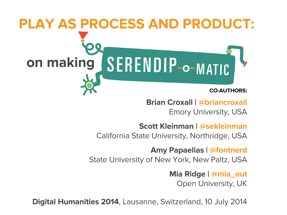
Here are my notes from the Digital Humanities 2014 paper on 'Play as Process and Product' I did with Brian Croxall, Scott Kleinman and Amy Papaelias based on the work of the 2013 One Week One Tool team.

Scott has blogged his notes about the first part of our talk, Brian's notes are posted as '“If hippos be the Dude of Love…”: Serendip-o-matic at Digital Humanities 2014' and you'll see Amy's work adding serendip-o-magic design to our slides throughout our three posts.

I'm Mia, I was dev/design team lead on Serendipomatic, and I'll be talking about how play shaped both what you see on the front end and the process of making it.

How did play shape the process?
The playful interface was a purposeful act of user advocacy – we pushed against the academic habit of telling, not showing, which you see in some form here. We wanted to entice people to try Serendipomatic as soon as they saw it, so the page text, graphic design, 1 – 2 – 3 step instructions you see at the top of the front page were all designed to illustrate the ethos of the product while showing you how to get started.

How can a project based around boring things like APIs and panic be playful? Technical decision-making is usually a long, painful process in which we juggle many complex criteria. But here we had to practice 'rapid trust' in people, in languages/frameworks, in APIs, and this turned out to be a very freeing experience compared to everyday work.
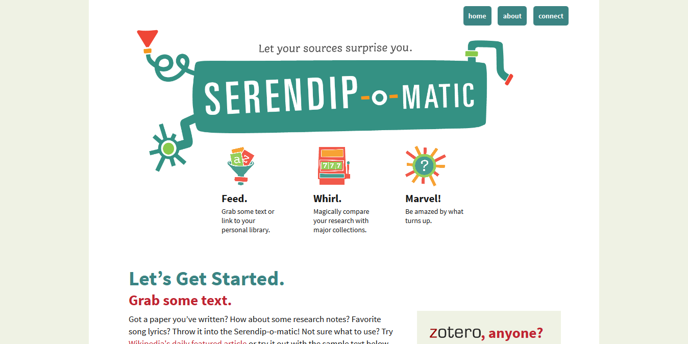
Serendip-o-matic_ Let Your Sources Surprise You.png
First, two definitions as background for our work…

Just in case anyone here isn't familiar with APIs, APIs are a set of computational functions that machines use to talk to each other. Like the bank in Monopoly, they usually have quite specific functions, like taking requests and giving out information (or taking or giving money) in response to those requests. We used APIs from major cultural heritage repositories – we gave them specific questions like 'what objects do you have related to these keywords?' and they gave us back lists of related objects.
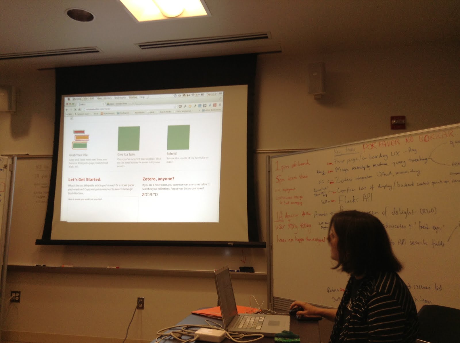
2013-08-01 10.14.45.jpg
The term 'UX' is another piece of jargon. It stands for 'user experience design', which is the combination of graphical, interface and interaction design aimed at making products both easy and enjoyable to use. Here you see the beginnings of the graphic design being applied (by team member Amy) to the underlying UX related to the 1-2-3 step explanation for Serendipomatic.

Feed.

serendipomatic_presentation p9.png
The 'feed' part of Serendipomatic parsed text given in the front page form into simple text 'tokens' and looked for recognisable entities like people, places or dates. There's nothing inherently playful in this except that we called the system that took in and transformed the text the 'magic moustache box', for reasons lost to time (and hysteria).

Whirl.
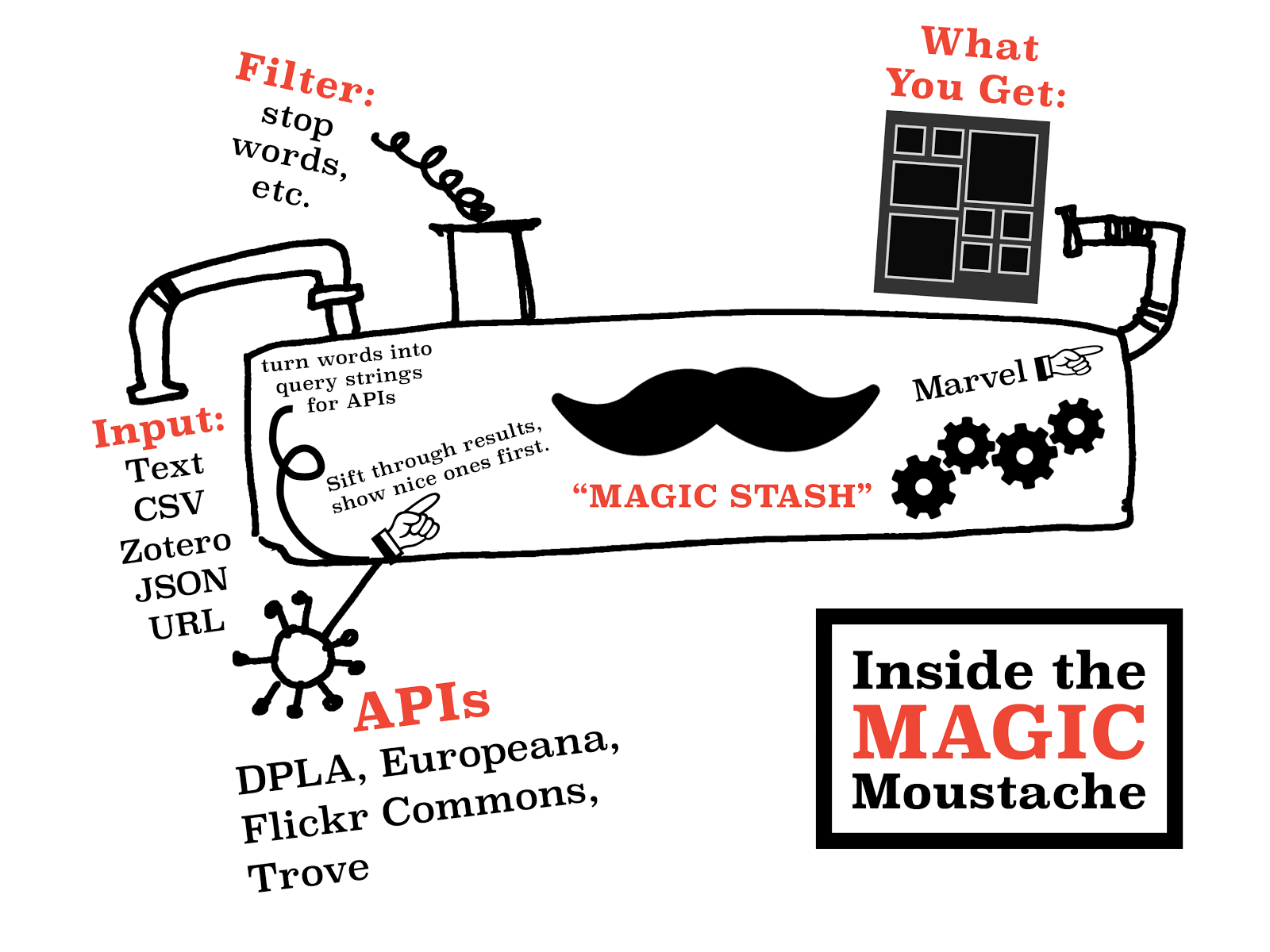
These terms were then mixed into database-style queries that we sent to different APIs. We focused on primary sources from museums, libraries, archives available through big cultural aggregators. Europeana and the Digital Public Library of America have similar APIs so we could get a long way quite quickly. We added Flickr Commons into the list because it has high-quality, interesting images and brought in more international content. [It also turns out this made it more useful for my own favourite use for Serendipomatic, finding slide or blog post images.] The results are then whirled up so there's a good mix of sources and types of results. This is the heart of the magic moustache.

Marvel.

User-focused design was key to making something complicated feel playful. Amy's designs and the Outreach team work was a huge part of it, but UX also encompasses micro-copy (all the tiny bits of text on the page), interactions (what happened when you did anything on the site), plus loading screens, error messages, user documentation.
We knew lots of people would be looking at whatever we made because of OWOT publicity; you don't get a second shot at this so it had to make sense at a glance to cut through social media noise. (This also meant testing it for mobiles and finding time to do accessibility testing – we wanted every single one of our users to have a chance to be playful.)


Without all this work on the graphic design – the look and feel that reflected the ethos of the product – the underlying playfulness would have been invisible. This user focus also meant removing internal references and in-jokes that could confuse people, so there are no references to the 'magic moustache machine'. Instead, 'Serendhippo' emerged as a character who guided the user through the site.

moustache.png But how does a magic moustache make a process playful?
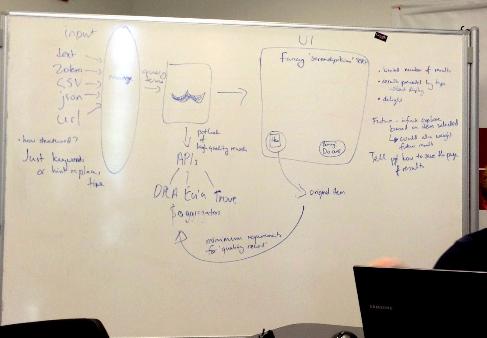
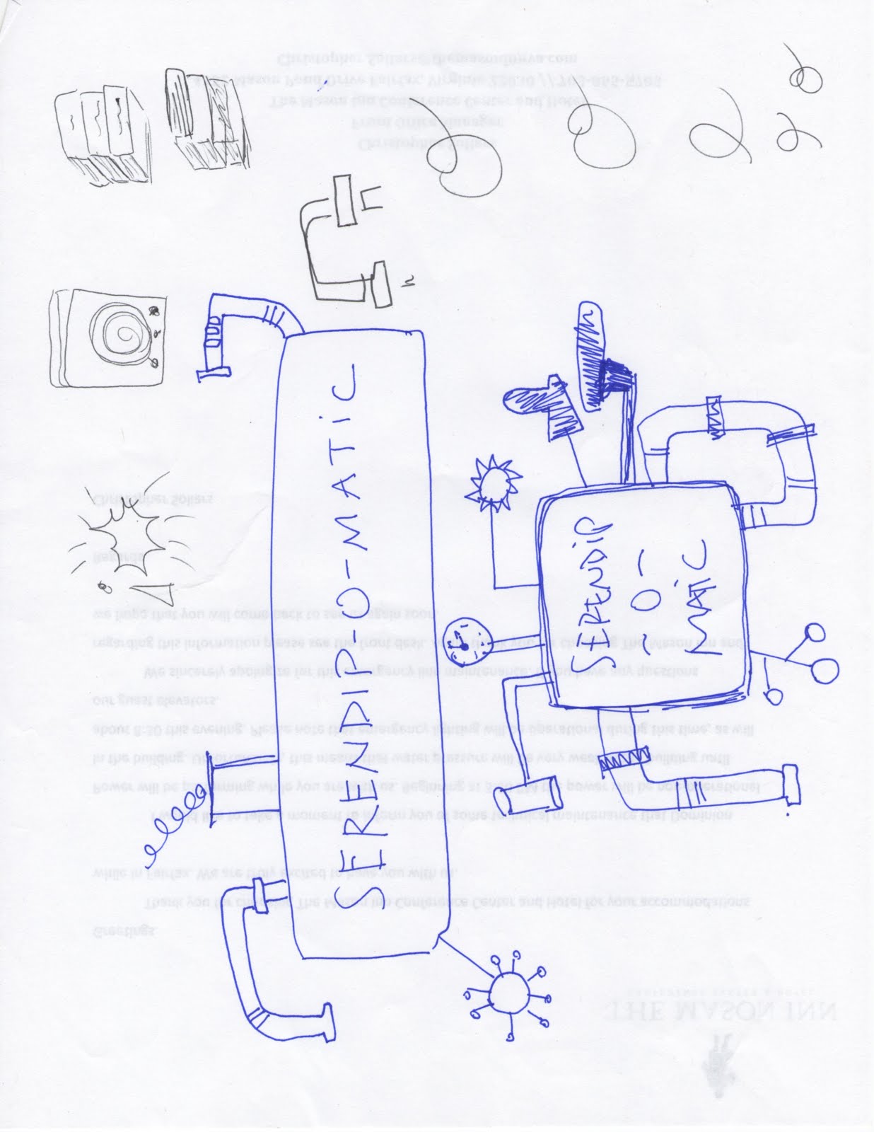
magicmoustachediagram.jpgThe moustache was a visible signifier of play. It appeared in the first technical architecture diagram – a refusal to take our situation too seriously was embedded at the heart of the project. This sketch also shows the value of having a shared physical or visual reference – outlining the core technical structure gave people a shared sense of how different aspects of their work would contribute to the whole. After all, if there aren't any structure or rules, it isn't a game.

This playfulness meant that writing code (in a new language, under pressure) could then be about making the machine more magic, not about ticking off functions on a specification document. The framing of the week as a challenge and as a learning experience allowed a lack of knowledge or the need to learn new skills to be a challenge, rather than a barrier. My role was to provide just enough structure to let the development team concentrate on the task at hand.

In a way, I performed the role of old-fashioned games master, defining the technical constraints and boundaries much as someone would police the rules of a game. Previous experience with cultural heritage APIs meant I was able to make decisions quickly rather than letting indecision or doubt become a barrier to progress. Just as games often reduce complex situations to smaller, simpler versions, reducing the complexity of problems created a game-like environment.

UX matters

Ultimately, a focus on the end user experience drove all the decisions about the backend functionality, the graphic design and micro-copy and how the site responded to the user.

It's easy to forget that every pixel, line of code or text is there either through positive decisions or decisions not consciously taken. User experience design processes usually involve lots of conversation, questions, analysis, more questions, but at OWOT we didn't have that time, so the trust we placed in each other to make good decisions and in the playful vision for Serendipomatic created space for us to focus on creating a good user experience. The whole team worked hard to make sure every aspect of the design helps people on the site understand our vision so they can get with exploring and enjoying Serendipomatic.

Some possible real-life lessons I didn't include in the paper

One Week One Tool was an artificial environment, but here are some thoughts on lessons that could be applied to other projects:

  • Conversations trump specifications and showing trumps telling; use any means you can to make sure you're all talking about the same thing. Find ways to create a shared vision for your project, whether on mood boards, technical diagrams, user stories, imaginary product boxes. 
  • Find ways to remind yourself of the real users your product will delight and let empathy for them guide your decisions. It doesn't matter how much you love your content or project, you're only doing right by it if other people encounter it in ways that make sense to them so they can love it too (there's a lot of UXy work on 'on-boarding' out there to help with this). User-centred design means understanding where users are coming from, not designing based on popular opinion.you can use tools like customer journey maps to understand the whole cycle of people finding their way to and using your site (I guess I did this and various other UXy methods without articulating them at the time). 
  • Document decisions and take screenshots as you go so that you've got a history of your project – some of this can be done by archiving task lists and user stories. 
  • Having someone who really understands the types of audiences, tools and materials you're working with helps – if you can't get that on your team, find others to ask for feedback – they may be able to save you lots of time and pain.
  • Design and UX resources really do make a difference, and it's even better if those skills are available throughout the agile development process.
Does 'slow art day' work online?

Saturday was 'slow art day', and the Getty Museum (@GettyMuseum) shared a Robert Hughes clip that really resonated with me:

'We have had a gutful of fast art and fast food. What we need more of is slow art: art that holds time as a vase holds water: art that grows out of modes of perception and whose skill and doggedness make you think and feel; art that isn't merely sensational, that doesn't get its message across in 10 seconds, that isn't falsely iconic, that hooks onto something deep-running in our natures. In a word, art that is the very opposite of mass media.'

I was tied to my desk writing that day so I wondered how I could have a similar experience: can you 'do' slow art online? Assuming you can switch off all the other distractions of email, social media, flashing ads, etc, and ignore the fact that your house, office or library is full of other tasks and temptations, can you slow down and sit in front of one art work and have a similar experience through an image on a screen, or does being in a gallery add something to the process? On the other hand, high-resolution images and reflectance transformation imaging (RTI) mean you can see details you'd never see in a gallery so you can explore the artwork itself more deeply*. And to remove the screen from the equation, would looking at a really good print of a painting be as rewarding as looking at the original? And what of installations and sculpture?

Related to that, I've been wondering how to relate online collections (whether thematic, exhibition-style or old school catalogues) to audience motivations for visiting museums. I've just been reading a great overview of people's motivations for visiting museums in Dimitra Christidou's Re-Introducing Visitors: Thoughts and Discussion on John Falk’s Notion of Visitors’ Identity-Related Visit Motivations. Christidou summarises Falk and Storksdieck's 2005 research on 'museum-specific identities' reflecting visitor motivations:

  1. Explorers are driven by their personal curiosity, their urge to discover new things.
  2. Facilitators visit the museum on behalf of others’ special interests in the exhibition or the subject-matter of the museum.
  3. Experience seekers are these visitors who desire to see and experience a place, such as tourists.
  4. Professional hobbyists are those with specific knowledge in the subject matter of an exhibition and specific goals in mind.
  5. Rechargers seek a contemplative or restorative experience, often to let some steam out of their systems.
Once I'd gotten past the amusing mental image of Facebook's Mark Zuckerberg's head exploding at the concept of 'big' and 'small' online identities that change according to context, interests, motivations, etc**, I thought the article provided a useful framework for returning to the question of 'what are museum websites for?'. We can safely assume that most gallery sites consider the needs of 'professional hobbyists', but what of the other motivations? Some of these motivations are embedded in social experiences – do art sites enable multi-user experiences online, or do they assume that 'sharing' or facilitation only happens via social media? Does looking at art online go deep enough to count as an 'experience'? And how much of the 'recharging' experience is tied to the act of getting to a particular space at a particular time, or to the affordances of the space itself and its physical separation from most distractions of the world?

What new motivations should be added for online experiences of museum exhibitions and objects? What's enabled by the convenience, accessibility and discoverability of art online? And to return to slow art, how can museums use text and design to cue people to slow down and look at art for minutes at a time without getting in the way of people who want a quick experience? (And is this the same basic question I'd asked earlier about 'enabling punctum' or 'what's the effect of all this aggregation of museum content on the user experience'?)

* Assuming you don't look so closely that you slip into 'inappropriate peering'.
** I'm sure Zuckerberg knows people have different identities in different situations, it's just more convenient for Facebook not to care. Christopher 'moot' Poole opposed this push quite well in a series of talks in 2011.

Notes from 'Crowdsourcing in the Arts and Humanities'

Last week I attended a one-day conference, 'Digital Impacts: Crowdsourcing in the Arts and Humanities' (#oxcrowd), convened by Kathryn Eccles of Oxford's Internet Institute, and I'm sharing my (sketchy, as always) notes in the hope that they'll help people who couldn't attend.

Stuart Dunn reported on the Humanities Crowdsourcing scoping report (PDF) he wrote with Mark Hedges and noted that if we want humanities crowdsourcing to take off we should move beyond crowdsourcing as a business model and look to form, nurture and connect with communities.  Alice Warley and Andrew Greg presented a useful overview of the design decisions behind the Your Paintings Tagger and sparked some discussion on how many people need to view a painting before it's 'completed', and the differences between structured and unstructured tagging. Interestingly, paintings can be 'retired' from the Tagger once enough data has been gathered – I personally think the inherent engagement in tagging is valuable enough to keep paintings taggable forever, even if they're not prioritised in the tagging interface.  Kate Lindsay brought a depth of experience to her presentation on 'The Oxford Community Collection Model' (as seen in Europeana 1914-1918 and RunCoCo's 2011 report on 'How to run a community collection online' (PDF)). Some of the questions brought out the importance of planning for sustainability in technology, licences, etc, and the role of existing networks of volunteers with the expertise to help review objects on the community collection days.  The role of the community in ensuring the quality of crowdsourced contributions was also discussed in Kimberly Kowal's presentation on the British Library's Georeferencer project. She also reflected on what she'd learnt after the first phase of the Georeferencer project, including that the inherent reward of participating in the activity was a bigger motivator than competitiveness, and the impact on the British Library itself, which has opened up data for wider digital uses and has more crowdsourcing projects planned. I gave a paper which was based on an earlier version, The gift that gives twice: crowdsourcing as productive engagement with cultural heritage, but pushed my thinking about crowdsourcing as a tool for deep engagement with museums and other memory organisations even further. I also succumbed to the temptation to play with my own definitions of crowdsourcing in cultural heritage: 'a form of engagement that contributes towards a shared, significant goal or research question by asking the public to undertake tasks that cannot be done automatically' or 'productive public engagement with the mission and work of memory institutions'.

Chris Lintott of Galaxy Zoo fame shared his definition of success for a crowdsourcing/citizen science project: it has to produce results of value to the research community in less time than could have been done by other means (i.e. it must have been able to achieve something with crowd that couldn't have without them) and discussed how the Ancient Lives project challenged that at first by turning 'a few thousand papyri they didn't have time to transcribe into several thousand data points they didn't have time to read'.  While 'serendipitous discovery is a natural consequence of exposing data to large numbers of users' (in the words of the Citizen Science Alliance), they wanted a more sophisticated method for recording potential discoveries experts made while engaging with the material and built a focused 'talk' tool which can programmatically filter out the most interesting unanswered comments and email them to their 30 or 40 expert users. They also have Letters for more structured, journal-style reporting. (I hope I have that right).  He also discussed decisions around full text transcriptions (difficult to automatically reconcile) vs 'rich metadata', or more structured indexes of the content of the page, which contain enough information to help historians decide which pages to transcribe in full for themselves.

Some other thoughts that struck me during the day… humanities crowdsourcing has a lot to learn from the application of maths and logic in citizen science – lots of problems (like validating data) that seem intractable can actually be solved algorithmically, and citizen science hypothesis-based approach to testing task and interface design would help humanities projects. Niche projects help solve the problem of putting the right obscure item in front of the right user (which was an issue I wrestled with during my short residency at the Powerhouse Museum last year – in hindsight, building niche projects could have meant a stronger call-to-action and no worries about getting people to navigate to the right range of objects).  The variable role of forums and participants' relationship to the project owners and each other came up at various points – in some projects, interactions with a central authority are more valued, in others, community interactions are really important. I wonder how much it depends on the length and size of the project? The potential and dangers of 'gamification' and 'badgeification' and their potentially negative impact on motivation were raised. I agree with Lintott that games require a level of polish that could mean you'd invest more in making them than you'd get back in value, but as a form of engagement that can create deeper relationships with cultural heritage and/or validate some procrastination over a cup of tea, I think they potentially have a wider value that balances that.

I was also asked to chair the panel discussion, which featured Kimberly Kowal, Andrew Greg, Alice Warley, Laura Carletti, Stuart Dunn and Tim Causer.  Questions during the panel discussion included:

  • 'what happens if your super-user dies?' (Super-users or super contributors are the tiny percentage of people who do most of the work, as in this Old Weather post) – discussion included mass media as a numbers game, the idea that someone else will respond to the need/challenge, and asking your community how they'd reach someone like them. (This also helped answer the question 'how do you find your crowd?' that came in from twitter)
  • 'have you ever paid anyone?' Answer: no
  • 'can you recruit participants through specialist societies?' From memory, the answer was 'yes but it does depend'.
  • something like 'have you met participants in real life?' – answer, yes, and it was an opportunity to learn from them, and to align the community, institution, subject and process.
  • 'badgeification?'. Answer: the quality of the reward matters more than the levels (so badges are probably out).
  • 'what happens if you force students to work on crowdsourcing projects?' – one suggestion was to look for entries on Transcribe Bentham in a US English class blog
  • 'what's happened to tagging in art museums, where's the new steve.museum or Brooklyn Museum?' – is it normalised and not written about as much, or has it declined?
  • 'how can you get funding for crowdsourcing projects?'. One answer – put a good application in to the Heritage Lottery Fund. Or start small, prove the value of the project and get a larger sum. Other advice was to be creative or use existing platforms. Speaking of which, last year the Citizen Science Alliance announced 'the first open call for proposals by researchers who wish to develop citizen science projects which take advantage of the experience, tools and community of the Zooniverse. Successful proposals will receive donated effort of the Adler-based team to build and launch a new citizen science project'.
  • 'can you tell in advance which communities will make use of a forum?' – a great question that drew on various discussions of the role of communities of participants in supporting each other and devising new research questions
  • a question on 'quality control' provoked a range of responses, from the manual quality control in Transcribe Bentham and the high number of Taggers initially required for each painting in Your Paintings which slowed things down, and lead into a discussion of shallow vs deep interactions
  • the final questioner asked about documenting film with crowdsourcing and was answered by someone else in the audience, which seemed a very fitting way to close the day.
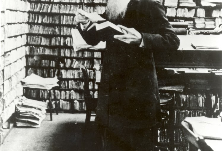
James Murray in his Scriptorium with thousands of word references sent in by members of the public for the first Oxford English Dictionary. Early crowdsourcing?

If you found this post useful, you might also like Frequently Asked Questions about crowdsourcing in cultural heritage or my earlier Museums and the Web paper on Playing with Difficult Objects – Game Designs to Improve Museum Collections.

Designing for participatory projects: emergent best practice, getting discussion started

I was invited over to New Zealand (from Australia) recently to talk at Te Papa in Wellington and the Auckland Museum.  After the talks I was asked if I could share some of my notes on design for participatory projects and for planning for the impact of participatory projects on museums.  Each museum has a copy of my slides, but I thought I'd share the final points here rather than by email, and take the opportunity to share some possible workshop activities to help museums plan audience participation around its core goals.

Both talks started by problematising the definition of a 'museum website' – it doesn't work to think of your 'museum website' as purely stuff that lives under your domain name when it's now it's also the social media accounts under your brand, your games and mobile apps, and maybe also your objects and content on Google Art Project or even your content in a student’s Tumblr.  The talks were written to respond to the particular context of each museum so they varied from there, but each ended up with these points.  The sharp-eyed among you might notice that they're a continuation of ideas I first shared in my Europeana Tech keynote: Open for engagement: GLAM audiences and digital participation.  The second set are particularly aimed at helping museums think about how to market participatory projects and sustain them over the longer term by making them more visible in the museum as a whole.

Best practice in participatory project design

  • Have an answer to 'Why would someone spend precious time on your project?'
  • Be inspired by things people love
  • Design for the audience you want
  • Make it a joy to participate
  • Don't add unnecessary friction, barriers (e.g. don't add sign-up forms if you don’t really need them, or try using lazy registration if you really must make users create accounts)
  • Show how much you value contributions (don't just tell people you value their work)
  • Validate procrastination – offer the opportunity to make a difference by providing meaningful work
  • Provide an easy start and scaffolded tasks (see e.g. Nina Simon's Self-Expression is Overrated: Better Constraints Make Better Participatory Experiences)
  • Let audiences help manage problems – let them know which behaviours are acceptable and empower them to keep the place tidy
  • Test with users; iterate; polish

Best practice within your museum

  • Fish where the fish are – find the spaces where people are already engaging with similar content and see how you can slot in, don't expect people to find their way to you unless you have something they can’t find anywhere else
  • Allow for community management resources – you’ll need some outreach to existing online and offline communities to encourage participation, some moderation and just a general sense that the site hasn’t been abandoned. If you can’t provide this for the life of the project, you might need to question why you’re doing it.
  • Decide where it's ok to lose control. Try letting go… you may find audiences you didn't expect, or people may make use of your content in ways you never imagined. Watch and learn and tweak in response – this is a good reason to design in iterations, and to go into public or invited-beta earlier rather than later. 
  • Realistically assess fears, decide acceptable levels of risk. Usually fears can be turned into design requirements, they’re rarely show-stoppers.
  • Have a clear objective, ideally tied to your museum’s mission. Make sure the point of the project is also clear to your audience.
  • Put the audience needs first. You’re asking people to give up their time and life experience, so make sure the experience respects this. Think carefully before sacrificing engagement to gain efficiency.
  • Know how to measure success
  • Plan to make the online activity visible in the organisation and in the museum. Displaying online content in the museum is a great way to show how much you value it, as well as marketing the project to potential contributors.  Working out how you can share the results with the rest of the organization helps everyone understand how much potential there is, and helps make online visitors ‘real’.
  • Have an exit strategy – staff leave, services fold or change their T&Cs

I'd love to know what you think – what have I missed?  [Update: for some useful background on the organisational challenges many museums face when engaging with technology, check out Collections Access and the use of Digital Technology (pdf).]

More on designing museum projects for audience participation

I prepared this activity for one of the museums, but on the day the discussion after my talk went on so long that we didn't need to use a formal structure to get people talking. In the spirit of openness, I thought I'd share it. If you try it in your organisation, let me know how it goes!

The structure – exploratory idea generation followed by convergence and verification – was loosely based on the 'creativity workshops' developed by City University's Centre for Creativity (e.g. the RESCUE creativity workshops discussed in Use and Influence of Creative Ideas and Requirements for a Work-Integrated Learning System).  It's designed to be a hackday-like creative activity for non-programmers.

In small groups…

  • Pick two strategic priorities or organisational goals…
  • In 5 minutes: generate as many ideas as possible
  • In 2 minutes: pick one idea to develop further

Ideas can include in-gallery and in-person activity; they must include at least two departments and some digital component.

Developing your idea…
Ideas can include in-gallery and in-person activity; they must include at least two departments

  • You have x minutes to develop your idea
  • You have 2 minutes each to report back. Include: which previous museum projects provide relevant lessons? How will you market it? How will it change the lives of its target audience? How will it change the museum?
  • How will you alleviate potential risks?  How will you maximise potential benefits?
  • You have x minutes for general discussion. How can you build on the ideas you've heard?

For bonus points…

These discussion points were written for another museum, but they might be useful for other organisations thinking about audience participation and online collections:

What are the museum’s goals in engaging audiences with collections online?

  • What does success look like?
  • How will it change the museum?
  • Which past projects provide useful lessons?

How can the whole organisation be involved in supporting online conversations?

  • What are the barriers?
  • What small, sustainable steps can be taken?
  • Where are online contributions visible in the museum?

Museum technologists redux: it's not about us

Recently there's been a burst of re-energised conversations on Twitter, blogs and inevitably at MW2012 (Museums on the Web 2012) about museum technologists, about breaking out of the bubble, about digital strategies vs plain old strategies for museums.  This is a quick post (because I only ever post when I should be writing a different paper) to make sure my position is clear.

If you're reading this you probably know that these are important issues to discuss, and it's exciting thinking about the organisational change issues museums will rise to in order to stay relevant, but it's also important to step back and remind ourselves that ultimately, it's not about us.  It's not about our role as museum technologists, or museums as organisations.

Museum technologists should be advocates for the digital audience, and guide museums in creating integrated, meaningful experiences, but we should also make sure that other museum staff know we still share their values and respect their expertise, and dispel myths about being zealots of openness at the expense of other requirements or wanting to devalue the physical experience.

It's about valuing the digital experiences our audiences have in our galleries, online and on the devices they carry in their pockets.  It's about understanding that online visitors are real visitors too.  It's about helping people make the most of their physical experiences by extending and enhancing their understandings of our collections and the world that shaped them.  It's about showing the difference digital makes by showing the impact it can have for a museum seeking to fulfil its mission for audiences it can't see as well as those right under its nose.

I'm a museum technologist, but maybe in my excitement about its potential I haven't been clear enough: I'm not in love with technology, I'm in love with what it enables – better museums, and better museum experiences.

Usability: the key that unlocks geeky goodness

This is a quick pointer to three posts about some usability work I did for the JISC-funded Pelagios project, and a reflection on the process. Pelagios aims to 'help introduce Linked Open Data goodness into online resources that refer to places in the Ancient World'. The project has already done lots of great work with the various partners to bring lots of different data sources together, but they wanted to find out whether the various visualisations (particularly the graph explorer) let users discover the full potential of the linked data sets.

I posted on the project blog about how I worked out a testing plan to encourage user-centred design and set up the usability sessions in Evaluating Pelagios' usability, set out how a test session runs (with sample scripts and tasks) in Evaluating usability: what happens in a user testing session? and finally I posted some early Pelagios usability testing results. The results are from a very small sample of potential users but they were consistent in the issues and positive results uncovered.

The wider lesson for LOD-LAM (linked open data in library, archives, museums) projects is that user testing (and/or a strong user-centred design process) helps general audiences (including subject specialists) appreciate the full potential of a technically-led project – without thoughtful design, the results of all those hours of code may go unloved by the people they were written for. In other words, user experience design is the key that unlocks the geeky goodness that drives these projects. It's old news, but the joy of user testing is that it reminds you of what's really important…

Links of interest – November 2009

I've fallen into the now-familiar trap of posting interesting links on twitter and neglecting my blog, but twitter is currently so transitory I figure it's worth collecting the links for perusal at your leisure. Sometimes I'll take advantage of the luxury of having more than 140 characters and add comments [in brackets].

And stuff I really must find time to read properly:
Finally, a tweet about an interview with me about the Cosmic Collections competition.
I really should group those tweets and replace all the shortened links with the full URLs but it's already taken a surprisingly long time to put this post together.