This week I was in Luxembourg for a workshop on Network Visualisation in the Cultural Heritage Sector, organised by Marten Düring and held on the Belval campus of the University of Luxembourg.
In my presentation, I responded to some of the questions posed in the workshop outline:
In this workshop we want to explore how network visualisations and infrastructures will change the research and outreach activities of cultural heritage professionals and historians. Among the questions we seek to discuss during the workshop are for example: How do users benefit from graphs and their visualisation? Which skills do we expect from our users? What can we teach them? Are SNA [social network analysis] theories and methods relevant for public-facing applications? How do graph-based applications shape a user’s perception of the documents/objects which constitute the data? How can applications benefit from user engagement? How can applications expand and tap into other resources?
A rough version of my talk notes is below. The original slides are also online.
Network visualisations and the 'so what?' problem
Caveat
While I may show examples of individual network visualisations, this talk isn't a critique of them in particular. There's lots of good practice around, and these lessons probably aren't needed for people in the room.
Fundamentally, I think network visualisations can be useful for research, but to make them more effective tools for outreach, some challenges should be addressed.
Context
I'm a Digital Curator at the British Library, mostly working with pre-1900 collections of manuscripts, printed material, maps, etc. Part of my job is to help people get access to our digital collections. Visualisations are a great way to firstly help people get a sense of what's available, and then to understand the collections in more depth.
I've been teaching versions of an 'information visualisation 101' course at the BL and digital humanities workshops since 2013. Much of what I'm saying now is based on comments and feedback I get when presenting network visualisations to academics, cultural heritage staff (who should be a key audience for social network analyses).
Provocation: digital humanists love network visualisations, but ordinary people say, 'so what'?
 And this is a problem. We're not conveying what we're hoping to convey.
When teaching datavis, I give people time to explore examples like this, then ask questions like 'Can you tell what is being measured or described? What do the relationships mean?'. After talking about the pros and cons of network visualisations, discussion often reaches a 'yes, but so what?' moment.
Here are some examples of problems ordinary people have with network visualisations…
Location matters
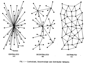
Spatial layout based on the pragmatic aspects of fitting something on the screen using physics, rules of attraction and repulsion doesn't match what people expect to see. It's really hard for some to let go of the idea that spatial layout has meaning. The idea that location on a page has meaning of some kind is very deeply linked to their sense of what a visualisation is.
Animated physics is … pointless?
People sometimes like the sproinginess when a network visualisation resettles after a node has been dragged, but waiting for the animation to finish can also be slow and irritating. Does it convey meaning? If not, why is it there?
Size, weight, colour = meaning?
The relationship between size, colour, weight isn't always intuitive – people assume meaning where there might be none.
In general, network visualisations are more abstract than people expect a visualisation to be.
'What does this tell me that I couldn't learn as quickly from a sentence, list or table?'
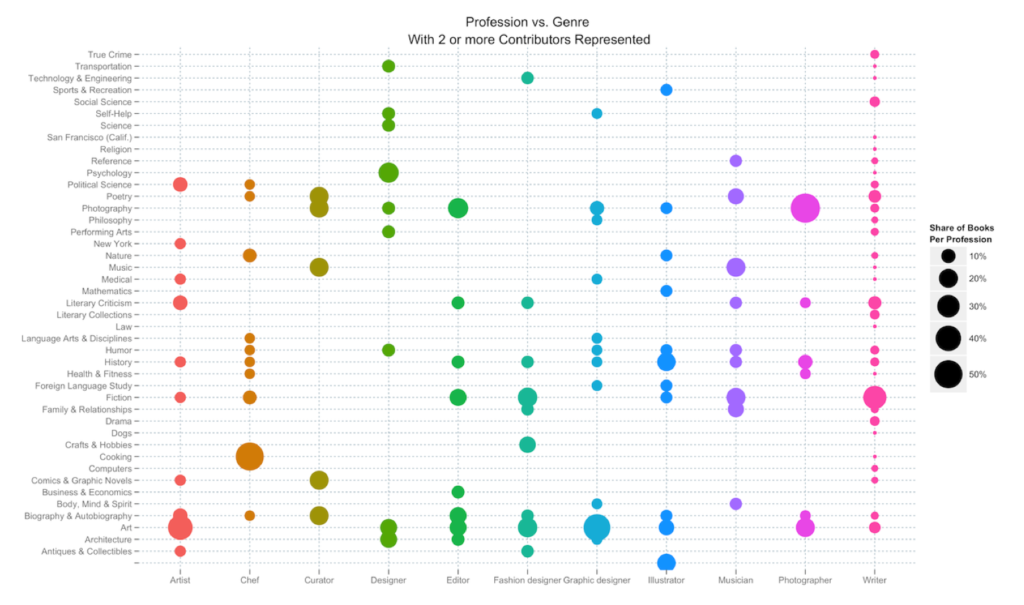
Scroll down the page that contains the network graph above and you get other visualisations. Sometimes they're much more positively received, particularly people feel they learn more from them than from the network visualisation.
Onto other issues with 'network visualisations as communication'…
Which algorithmic choices are significant?
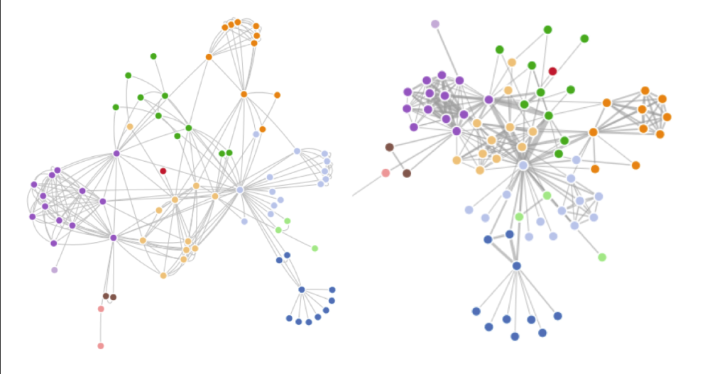
It's hard for novices to know which algorithmic and data-cleaning choices are significant, and which have a more superficial impact.
Untethered images
Images travel extremely well on social media. When they do so, they often leave information behind and end up floating in space. Who created this, and why? What world view does it represent? What source material underlies it, how was it manipulated to produce the image? Can I trust it?
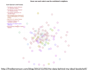
'Can't see the wood for the trees'
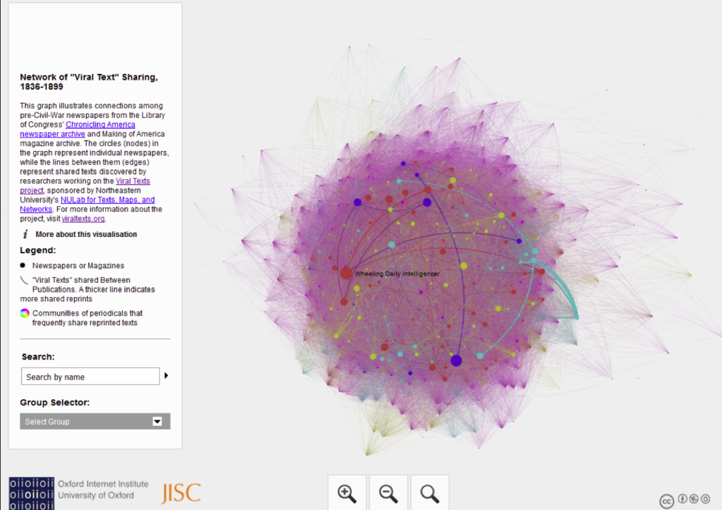
When I showed this to a class recently, one participant was frustrated that they couldn't 'see the wood for the trees'. The visualisations gives a general impression of density, but it's not easy to dive deeper into detail.
Stories vs hairballs
But when I started to explain what was being represented – the ways in which stories were copied from one newspaper to another – they were fascinated. They might have found their way there if they'd read the text but again, the visualisation is so abstract that it didn't hint at what lay underneath. (Also I have only very, very rarely seen someone stop to read the text before playing with a visualisation.)
No sense of change over time
This flattening of time into one simultaneous moment is more vital for historical networks than for literary ones, but even so, you might want to compare relationships between sections of a literary work.
No sense of texture, detail of sources
All network visualisations look similar, whether they're about historical texts or cans of baked beans. Dots and lines mask texture, and don't always hint at the depth of information they represent.
Jargon
Node. Edge. Graph. Directed, undirected. Betweenness. Closeness. Eccentricity.
There's a lot to take on to really understand what's being expressed in a network graph.
There is some hope…
Onto the positive bit!
Interactivity is engaging
People find the interactive movement, the ability to zoom and highlight links engaging, even if they have no idea what's being expressed. In class, people started to come up with questions about the data as I told them more about what was represented. That moment of curiosity is an opportunity if they can dive in and start to explore what's going on, what do the relationships mean?
…but different users have different interaction needs
For some, there's that frustration expressed earlier they 'can't get to see a particular tree' in the dense woods of a network visualisation. People often want to get to the detail of an instance of a relationship – the lines of text, images of the original document – from a graph.
This mightn't be how network visualisations are used in research, but it's something to consider for public-facing visualisations. How can we connect abstract lines or dots to detail, or provide more information about what the relationship means, show the quantification expressed as people highlight or filter parts of a graph? A harder, but more interesting task is hinting at the texture or detail of those relationships.
Proceed, with caution
One of the workshop questions was 'Are social network analysis theories and methods relevant for public-facing applications?' – and maybe the answer is a qualified yes. As a working tool, they're great for generating hypotheses, but they need a lot more care before exposing them to the public.
[As an aside, I’d always taken the difference between visualisations as working tools for exploring data – part of the process of investigating a research question – and visualisation as an output – a product of the process, designed for explanation rather than exploration – as fundamental, but maybe we need to make that distinction more explicit.]
But first – who are your 'users'?
During this workshop, at different points we may be talking about different 'users' – it's useful to scope who we mean at any given point. In this presentation, I was talking about end users who encounter visualisations, not scholars who may be organising and visualising networks for analysis.
Sometimes a network visualisation isn't the answer … even if it was part of the question.
As an outcome of an exploratory process, network visualisations are not necessarily the best way to present the final product. Be disciplined – make yourself justify the choice to use network visualisations.
No more untethered images
Include an extended caption – data source, tools and algorithms used. Provide a link to find out more – why this data, this form? What was interesting but not easily visualised? Let people download the dataset to explore themselves?
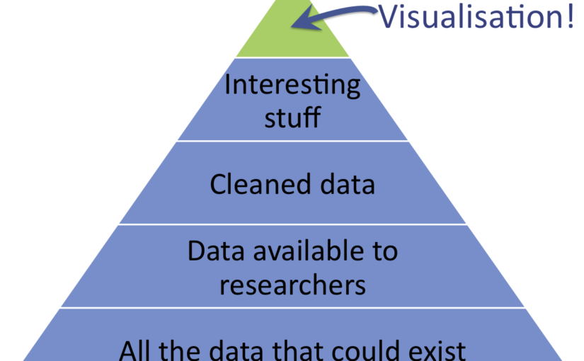
Present visualisations as the tip of the data iceberg
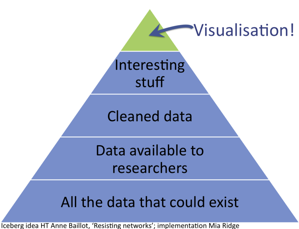
Lots of interesting data doesn't make it into a visualisation. Talking about what isn't included and why it was left out is important context.
Talk about data that couldn't exist
Beyond the (fuzzy, incomplete, messy) data that's left out because it's hard to visualise, data that never existed in the first place is also important:
'because we're only looking on one axis (letters), we get an inflated sense of the importance of spatial distance in early modern intellectual networks. Best friends never wrote to each other; they lived in the same city and drank in the same pubs; they could just meet on a sunny afternoon if they had anything important to say. Distant letters were important, but our networks obscure the equally important local scholarly communities.'
Scott Weingart, 'Networks Demystified 8: When Networks are Inappropriate'
Help users learn the skills and knowledge they need to interpret network visualisations in context.
How? Good question! This is the point at which I hand over to you…
Post-script
Thanks to Digital Humanities Now for featuring this post as an Editor's Choice!