I went to Mona – David Walsh's Museum of Old and New Art – in Hobart with my parents this week, and I'm quickly posting my impressions now, as my best intentions of posting a proper review later will probably be squished by the demands of my PhD and travel. I've also posted photos from my visit, though you may not be able to see my longer notes without clicking through to each photo.
Quick context: I'm a museum technologist and experience designer/analyst (though I'm currently a full-time PhD candidate researching digital history and crowdsourcing), we went from Melbourne to Tasmania specifically to see Mona, my parents are beyond retirement age but keep up with technology and are generally pretty active (physically and culturally). I had read various bits and pieces from other museum professionals about their visits, but didn't discuss them with my parents beforehand because I wanted to observe their reactions. (Being observed while engaging with technology or museum experiences is an occupational hazard for my friends and family and I thank them for their patience with me!) I'd deliberately gone with very few expectations about the building and artworks, not least because one of the works I'd most wanted to see had already been removed from display and I didn't want to be disappointed if I missed others.
The onboarding experience
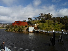 |
| Mona from the boat |
Forgive the UX jargon-laden pun, but your experience of Mona begins with your journey there. Both transport options that leave from the matt black ferry terminal are called 'Mona Roma' (geddit? 'Roamer', though it probably only works with an Australian accent). The boat is painted camouflage greys and the mini bus has hot pink flames down its sides. The boat trip up the Derwent River was a nice bit of bonus sightseeing for a tourist like me, and the captain provided a brief commentary as we travelled. The passengers mostly seemed to be tourists, from backpackers to retirees, from Australia and across the world. Some people near us talked about their visit to the Guggenheim in Bilbao, others seemed to be there because Mona is on the list of things to do in Hobart. I'd love to know how many were going for the whole 'controversial' experience, how many to tick off one of Hobart's sites and how many were going for the art.
When you arrive on site, you head up stairs from the landing, then a courtyard draws some visitors on to explore the grounds before entering the museum (and presumably helping avoid queues when a ferry arrives). I loved Wim Delvoye's concrete truck (not that I knew what it was at the time, because Mona doesn't have captions – one of the reasons it's been 'controversial') and the views across the suburbs and river.
You're given a printed Visitor Guide with your ticket (including a map, though printed in elegant thin grey type on black so almost impossible for my parents to read). The rules at the top of the stairs were clear – no food or drink, 'no flash' (so presumably other photography is ok – though I've just seen that the Visitor Guide says you can't put photos on 'personal websites' without permission – does that include social media? The guide blithely says 'Buy a postcard', assuming you found one of the artwork you liked in the shop, but the O page encourages you to 'share artworks with friends via facebook and twitter' so I'm a bit confused about what's ok and I take back it about the rules being clear!).
Then it's down the spiral staircase into the depths of the earth. You get glimpses of other galleries on the way down to the third level, interspersed with sandstone and concrete walls that still bear construction marks.
The O
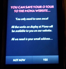 |
| Would this prompt you to save the tour? |
At the bottom of the stairs, you're given your 'O', or interactive guide (basically an iPod Touch in a solid case). The 'O' is one reason museum technologists and exhibition designers have been so curious about MONA. As the guide says:
'We don't have labels on the walls. We have the O. Use it to read about the art on display and to listen to interviews with the artists. It's free.'
There are seats near the Void Bar that are also handily placed for sitting down and sorting yourself out before you start, so I took a few photos as I got started with my O. Getting started is pretty simple (and as expected, my parents had no trouble with it). It explains that you should 'tap the O update button' when moving between galleries to get a list of artworks nearby, then 'tap an artwork in the list to delve further'. When you tap into an artwork, you see a thumbnail image, artwork title, date, artist name, then a brief artist bio and list of materials used in the artwork. There are options in the top right-hand corner to 'love' or 'hate' the artwork. There's no room for neutrality, though I wonder if a shrug is possibly the worse possible response to a modern artwork and worth recording on some level? (Though they could presumably easily get a list of the works that elicited the fewest love or hate responses.)
The additional information icons for the first work I looked at were tied to the 'Red Queen' exhibition theme – Ruminations, Tweedledum, Jabberwocky (additional media, often audio). Others were 'gonzo' (David Walsh's voice), 'art wank' (art historical information), 'ideas' (often quotes from literature, sometimes questions, but only once a clunky museum education-style question). There seemed to be a 'Red Queen exhibition' view that shows only nearby artworks with special interpretation (Mum discovered it accidentally but as the icon change was very subtle she didn't realise why it wasn't showing anything around her; with a bit more signposting it'd be a useful function for repeat visitors who want to catch up on new stuff). Rather than a traditional exhibition with 'key messages' and learning outcomes, the Red Queen seemed to be a group of works collected together to think about particular themes (and in a sense is probably a microcosm of Walsh's overall collecting strategy). Intellectual concerns emerged in some of the interpretation, but there wasn't an overall narrative, and I didn't miss that one little bit. Mona probably showed me that I love stories at an individual level but can feel a bit lectured-at by the whole-gallery narratives I've encountered in other museums. I discovered some audio content while still near the entrance so went back to ask for headphones, but they weren't handed out by default when we visited.
Saving 'your tour'
I was curious about when and how I'd be prompted to 'save my tour' for viewing later. The prompt appeared to be triggered after I'd tapped through to a few artworks, but when it appeared, it didn't really convince me to sign up – I'd love to know what their response rate is and whether they've tested different versions of the text. 'All the works on display at Mona will be available to you on our website' isn't as informative as the text on the O page which you'll probably only see if you'd saved your tour while onsite: 'Saving your tour while at Mona enables you to see your entire path through the museum including a list of viewed, loved and hated works. You can read all available interpretive material, share artworks with friends via facebook and twitter, change ratings and more…' Dad saved his tour, Mum didn't. I did because I had a sense of what the website would offer me, but I don't know if I would have otherwise.
What's around you?
The O's location awareness seemed to work pretty well (an achievement in itself), but I'd love a smarter version that knew the difference between physical proximity and physical accessibility. It's all very well to know an artwork is two metres from me, but if there's a gallery wall between me and the work, it's just another thing to scroll past in search of the artworks that are actually in the same space as me. The biggest usability issue with the O (for me) was the length of the list – if it more accurately reflected the artworks visible in the space (as opposed to physically nearby) then it'd be much easier to find the work you were looking for. Perhaps it doesn't need location at all – broadcasting a short list of the artworks in the room would be just as effective (though the list would still be quite long in some of the galleries), or electronic wall labels that can be read in low light could replace printed captions. The list view was pretty handy for working out whether you'd seen everything in a particular area, as it added 'viewed' to artworks you'd tapped into.
But if you couldn't match the artwork in front of you to a picture in the list, you were out of luck. No caption, nothing. I was reminded of Mary Beard's recent statement about "letting the objects speak for themselves" — which usually means "letting the objects speak to those who know about them already"'.
Overall, the O…
…kinda worked. I preferred reading about the works to listening to an audio guide (I hate having to listen to slow talkers when I could be skim-reading). Given the amount of material there was to read or listen to while you're around the artworks, more seats would have been ace (but at least there were some around, particularly in the higher levels). And the content was great – it took me two hours to go through the lowest floor because I wanted to read or listen to everything while I could relate it to the artwork in front of me. As the O screens glow when you need to read text, the galleries themselves could be dark and as a result some of the objects were *beautifully* lit.
There are some kinks to work out – I accidentally 'loved' or 'hated' one or two works when the O bumped about and tapped from a list to a work and hit a button, and couldn't undo it. It was also tricky when viewing artworks set into slits in the wall – it made the art feel both more monumental and intimate, but it meant scrabbling around on the O to find the right artwork while being aware that you were blocking the view for others in the meantime. That said, I've been wondering where friction has been deliberately left in and where it's a bug. Does it matter that it only registers an artwork as 'seen' if you've tapped through from the list to the caption? And if labels don't matter, why do you have to tap through to one for a work to count as 'seen'? Does it matter that you're poking at a device instead of doing an emu dart in-and-back to read a caption on a wall?
But overall, I would have preferred basic captions on the walls, leaving the O for works I wanted to explore beyond a simple what/who/when caption. Being able to find out more with the O added to my experience and I loved the different voices and approaches it enabled, but I spent an awful lot of time scrolling around trying to find the entry for the artwork I was standing in front of (and I helped other people find artworks when they got stuck). The technology doesn't exactly distract from the art, but it does get in the way a bit.
[Update: I realised a while later that they can get away with a lot with the O's text because a) the whole set-up is iconoclastic and b) we don't look to Walsh and his curator mates for authority. It doesn't matter if you think they're wrong or that they haven't been representative and even-handed – it's not their job. Public museums don't have that freedom, though they could still learn something from the amount of personality the O manages to convey.]
The O website
If you give your email address to save your tour, you get an email later that day with a link to retrieve it from the website. I can't see how to change my ratings, share artworks on twitter or facebook, and I only seem to be filter by 'Works you viewed' and 'Works you missed' not those I've loved or hated – which would be fine if all that wasn't promised on the front page. The timeline/map of what you saw is pretty but didn't give me direct access to works I remember seeing at different points in my visit. Artworks don't have permanent (indeed, any) URLs, so I can't easily save or share the artworks I'm still thinking about.
Since it only counts an artwork as 'viewed' if you tapped through from the list view, it's not really an accurate list of what you viewed or missed. I also have a feeling the O will beep if you take it out of the building, which makes 'viewing' some works outside the building tricky. I'd also love to be able to see pieces that aren't on display any more, and personally I think I'd have gotten more out of my visit if I'd been able to get a sense of some of the artworks on the website before I went – I'm definitely a 'listen to the album before going to the concert' kinda person. That said, being able to check the name of an artist or work easily is great – I wish all museum websites made it so easy to find the objects you've seen.
Art wank?
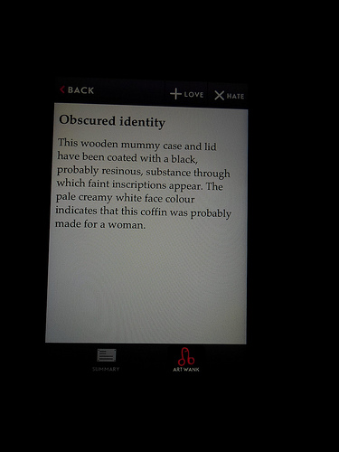 |
| The O's 'art wank' label and icon |
I don't think I would have thought anything of this, except that an American friend (hi @erodley!) was a bit taken aback by it. I didn't have to ask Mum (who is quite proper) what she thought of it as she came up to me and said she liked 'the art thing'. She wasn't bothered when she put on her glasses and realised the label said 'art wank' – she's heard it used in Parliament – though when she realised what it was I don't think she was too keen on the icon itself. I asked Dad later, and he thought it matched Walsh's 'knockabout character', deflating people who are a bit 'up themselves'.
Finally, the art…
I loved a few pieces, I didn't hate any pieces though one was mildly irritating, some I would have loved to label 'meh'. Mum made me jump on a trampoline so she could hear the bells, I lined up to experience Death with my parents, and I realised that there's something about 'traces of pigment' on old statues that gets me every time. By the time I left, I felt a bit like I'd spent the day at a playground for art – partly because all my senses had been involved at some point, and partly because of the eclectic range of works I'd encountered (and maybe even because of the 'mild peril' hinted at in the lead up to the Death gallery experience).
Many of the artworks I liked best had a story attached, though it might have come from the original context of its creation, from Walsh's gonzo pieces or related to something in my own life. Others were just plain beautiful or charming or made me think, which is probably a good line on which to finish.
—
Update: I've snuck away from the PhD write-up for a minute to collate a list of other museum nerds' reviews of Mona and the O:
- Seb Chan's Experiencing The O at MONA – a review
- Nancy Proctor's Love, Hate or Punt? Opinions and prevarications about MONA and its O
- Ed Rodley's Australia: MONA – revolutionary, and not, Australia: MONA's "The O" mobile guide, Australia: MONA's "The O" post-visit website
- Club Innovation & Culture France's Le Museum of Old and New Art (Mona) réinvente l'expérience muséale
- Aaron Straup Cope's The O and the Minutiae of the Future-Now
- Nicolaas Earnshaw's The O in MONA reviewed
- Geoff Barker's Wireless and Handheld Devices at the Museum of Old and New Art
- Regan Forrest's Reflections on a visit to MONA
Let me know of any others in the comments…
Also in poking around I've also found a link to a tiny snippet of Mona's art (mostly) not on display, including some of the content you probably would have seen on the O at the time.
[If I ever re-write this, I'm going to add a clickbait headline '3 things you'll love about MONA and 1 you'll hate'. Or 'This one weird trick that really works for art history'.]