Linking museums: machine-readable data in cultural heritage – meetup in London July 7

Somehow I've ended up organising an (very informal) event about 'Linking museums: machine-readable data in cultural heritage' on Wednesday, July 7, at a pub near Liverpool St Station. I have no real idea what to expect, but I'd love some feisty sceptics to show up and challenge people to make all these geeky acronyms work in the real museum world.

As I posted to the MCG list: "A very informal meetup to discuss 'Linking museums: machine-readable data in cultural heritage' is happening next Wednesday. I'm hoping for a good mix of people with different levels of experience and different perspectives on the issue of publishing data that can be re-used outside the institution that created it. … please do pass this on to others who may be interested. If you would like to come but can't get down to that London, please feel free to send me your questions and comments (or beer money)."

The basic details are: July 7, 2010, Shooting Star pub, London. 7:30 – 10pm-ish. More information is available at http://museum-api.pbworks.com/July-2010-meetup and you can let me know you're coming or register your interest.

In more detail…

Why?
I'm trying to cut through the chicken and egg problem – as a museum technologist, I can work towards getting machine-readable data available, but I'm not sure which formats and what data would be most useful for developers who might use it. Without a critical mass of take-up for any one type, the benefits of any one data source are more limited for developers. But museums seem to want a sense of where the critical mass is going to be so they can build for that. How do we cut through this and come up with a sensible roadmap?

Who?
You! If you're interested in using museum data in mashups but find it difficult to get started or find the data available isn't easily usable; if you have data you want to publish; if you work in a museum and have a
data publication problem you'd like help in solving; if you are a cheerleader for your favourite acronym…

Put another way, this event is for you if you're interested in publishing and sharing data about their museums and collections through technologies such as linked data and microformats.

It'll be pretty informal! I'm not sure how much we can get done but it'd be nice to put faces to names, and maybe start some discussions around the various problems that could be solved and tools that could be
created with machine-readable data in cultural heritage.

'Game mechanics for social good: a case study on interaction models for crowdsourcing museum collections enhancement'

I've been very quiet lately – exams for my MSc and work on the digital infrastructure for two new galleries (and a contemporary science news website) opening next week at the Science Museum have kept me busy – but I wanted to take a moment to post about my dissertation project. (Which reminds me, I should write up the architecture I designed to extend our core Sitecore CMS with WordPress to support social media-style interactions with Science Museum-authored content.)

Anyway. This project is for my dissertation for City University's Human-Centred Systems MSc. I'm happy to share the whole outline, but it's a bit academic in format for a blog post so I've just posted an excerpt here. I'd love to hear your comments, particularly if you know of or have been involved in creating, crowdsourced museum projects or games for social good.

'Game mechanics for social good: a case study on interaction models for crowdsourcing museum collections enhancement' is the current title – it's a bit of a mouthful but hopefully the project will do what it says on the tin.

Project description
The primary focus of this project is the design and evaluation of interactions applied to the context of an online museum collection in order to encourage members of the public to undertake specific tasks that will help improve the website.

The project will include a design and build component to create game-like interfaces for testing and evaluation, but the main research output is the analysis of museum crowdsourced projects and 'games for social good' to develop potential models for game-like interactions suitable for museum collections, and the subsequent evaluation of the proposed interaction models.

Aims and Objectives
This project aims to answer this question: can game-like interactions be designed to motivate people to undertake tasks on museum websites that will improve the overall quality of the website for other visitors?

More specifically, which elements of game mechanics are effective when applied to interfaces to crowdsource museum collections enhancement?

Objectives

  • Design game-like interaction models applicable to cultural heritage content and audiences through research, analysis and creativity workshops
  • Build an application and interfaces to create and store user-created content linked to collections content
  • Evaluate the effectiveness of game-like interaction models for eliciting useful content

Theory
Recent projects such as Armchair Revolutionary[1] and earlier projects such as Carnegie Mellon University's 'Games with a purpose'[2] and InterroBang?![3] are indicative of the trend for 'games for social good'. Crowdsourced projects such as the Guardian newspapers examination of MPs expense claims[4], the V&A Museum's image cropping[5], Brooklyn Museum's tagging game[6], the National Library of Australia's collaborative OCR corrections[7]; Chen's (2006) study of the application of Csikszentmihalyi's theory of 'flow' to game design; and Dr Jane McGonigal's ideas about multiplayer games as 'happiness engines'[8] all suggest that 'playful interactions' and crowd participation could be applied to help create specific content improvements on museum sites. Game mechanisms may help make tasks that would not traditionally considered fun or relaxing into a compelling experience.

Within the terms of this project, the output of a game-like interaction must produce an effect outside the interaction itself – that is, the result of a user's interactions with the site should produce beneficial effects for other site visitors who are not involved in the original interactions. To achieve this, it must generate content to enhance the site for subsequent visitors. Methods to achieve this could include creating trails of related objects, entering tags to describe objects, writing alternative labels or researching objects – these will be defined during the research phase and creativity workshops.

Methods and tools

The project is divided into several stages, each with their own methodology and considerations.

Research
The preliminary research process involves a literature review, research into game mechanics and the theory of flow, and research into museum audiences online. It will also include a series of short semi-structured interviews with people involved in creating crowdsourced projects on museum sites or game-like interactions to encourage the completion of set tasks (e.g. games for social good) in order to learn from their reflections on the design process; and analysis of existing sites in both these areas against the theories of game design. This research will define the metrics of the evaluation phase.

Creativity workshop(s)
The results of this research phase sets the parameters for creativity workshops designed to come up with ideas and possible designs for the game-like interfaces to be built. Possible objectives for the creativity workshop include:

  • designing methods for building different levels of challenge into the user experience in an environment that does not easily support different levels of challenge when museum-related skills remain at a constant level
  • creating experiences that are intrinsically rewarding to enable 'flow' within the constraints of available content

Build and test
In turn, the creativity workshops will help determine the interfaces to be built and tested in the later part of the project. The build will be iterative, and is planned to involve as many build-test-review-build iterations as will fit in the allocated time, in order to test as many variant interaction models as possible and support optimisation of existing designs after evaluation. User recruitment in this phase may be a sample of convenience from the target age group.

The interfaces will be developed in HTML, CSS and JavaScript, and published on a WordPress platform. This allows a neat separation of functionality and interface design. Session data (date, interface version, tester ID) can be recorded alongside user data. WordPress's template and plug-in based architecture also supports clear versioning between different iterations of the design, allowing reconstruction of earlier versions of the interfaces for later comparison, and enabling possible split A/B trials.

Analysis and write-up
Analysis will include the results of user testing and user data recorded in the WordPress platform to evaluate the performance of various interface and interaction designs. If the platform attracts usage outside the user testing sessions it may also include log file or Google Analytics analysis of use of the interfaces.
[1] https://www.armrev.org
[2] http://www.gwap.com/
[3] http://www.playinterrobang.com/
[4] http://mps-expenses.guardian.co.uk/
[5] http://collections.vam.ac.uk/crowdsourcing/
[6] http://www.brooklynmuseum.org/opencollection/tag_game/start.php
[7] http://newspapers.nla.gov.au/ndp/del/home
[8] http://www.futureofmuseums.org/events/lecture/mcgonigal.cfm

Edward Tufte on 'Beautiful Evidence'

Tonight I went to see Edward Tufte lecture on 'visual thinking and analytical design' at the Royal Geographic Society tonight. The room was packed, perhaps because lots of people were in town for UX London already. The event was organised by Intelligence Squared, who are apparently 'dedicated to creating knowledge through contest', which is an interesting goal in its own right.

It's been a long week, so I suspect my notes are pretty sketchy, but I'm posting them in case they're useful. Let me know if you spot any corrections. On with the talk…

[His basic thesis:] The method of production interferes with production [of knowledge?].

We do most of our serious visual thinking inside, on unreal flatland [2D] screens, looking at representations of real things, instead of being outside looking at real things. In the real world, most of our thinking would be about way-finding, rather than deep analysis.

Evidence is evidence. Information doesn't care what it is. The intellectual tasks remain constant regardless of the mode of production/consumption – we need evidence to understand and reason about the materials to hand. We might care about mode of production but we shouldn't segregate the information by modes of production. We need content-oriented design.

In manuscripts, the hand directly integrates words and image. When marks all come from same source e.g. hands then material is integrated. When technology has different modes of production e.g. type and drawings, then content is segregated by modes of production.

[He showed a 9th century centaur – the image was made of Latin words, a unification of text and image.] Visual meaning of Latin centaur is still clear despite language. The universality of images, the stupefying locality of languages. Images are cosmopolitan, words are local and parochial. When the language is unknown to the viewer, image and language are separated into comprehensible image and incomprehensible language.

'Content indifference' is the result of teaching that only design matters. The essential test is how well each assists understanding the understanding of the content, not how stylish they are. You must know the meaning of the content to design it.

The point of information display is to assist analytical thinking. One common task is to make comparisons. Take the intellectual task (e.g. 'make smart comparisons') and turn them into design principles. Tasks become instructions to the design. Otherwise it's just based on fashion or latest technology.

[He then had the lights turned up so people could view copies of Minard's map of Napoleon's Russian campaign in 1812. He used this to illustrate his Six Grand Principles of Analytical Design.]

  1. First Grand Principle of Analytical Design: show comparisons, contrasts, differences e.g. difference between those who left and those who returned.  Principles guide the design but also the content. A lot of his work is secretly about analytical thinking.
  2. Second Grand Principle of Analytical Design – show causality, dynamics, mechanisms, explanation. For policy thinking, intervention thinking – to produce an effect, you need to know about and govern the cause – show causality.  Thinking about how these are derived are producer commandments. But as they're derived from fundamental intellectual task they're also consumer tasks – you should be asking, as an audience, what is your task?  Minard's map shows causality with temperature.
  3. Third Grand Principle of Analytical Design – show multivariate data. Three or more factors, variables. i.e. show more than two variables. Reality is inherently multivariable.Minard showed six dimensions – the size of army, direction, temperature, dates, location (lat,long). It's not about the method of display. The design is so good that it's invisible. Good web design has to be enormously self-effacing. The task is for users to understand information, not admire the interface. People should be too busy going about their business to notice the design.
  4. Fourth Grand Principle of Analytical Design – the principle of mode indifference – completely integrate all content. No segregation by mode of content. Videos and tables should be embedded in text, not set aside with captions elsewhere. Information don't care what it is, cognitive tasks don't care what the mode of production is. Minard had paragraphs of text, statistical bits, annotations all over.  Cognitive styles in approaching material – really good analysts are indifferent to the mode of evidence, spirit is 'whatever it takes to explain it'. Driven by explanation. Enormous difference between process driven and content driven explanation. Academics make industry from process driven design but it should be whatever it takes to explain it – not what's lying around, not what I'm good at.
  5. Fifth Grand Principle of Analytical Design – document everything and tell people about it. Document sources, scales, missing data. It's the credibility argument. Two things you need to get across in a presentation – what the story is and why the audience should believe you. Audience has two tasks – trying to figure out the story and whether they can believe the presenter. An important way to have credibility is to have care and craft with respect to the data. Minard's two paragraphs are about documentation – assumptions, scales of measurement. Minard was a great engineer who designed bridges and canals – this has the facticity of an engineer. Minard didn't want quibbles about the facts – he wanted people to appreciate the disaster of war. It was meant as an anti-war poster right from the start. It was meant to show the horrors of war. Precision and accuracy in evidence helps his credibility.  Documentation is part of the fundamental quality control mechanism for preservation of credibility. As a consumer, you should be sceptical if people don't say where the data came from e.g. URLs or full data sets. Very few people look at the original data but making sure it's available is important.  Cherry picking is a big threat to the credibility of presenters – am I seeing the results of evidence, or of evidence selection? Providing source is a way of showing you're not a cherry picker.  Overall, incompetence is more likely to be an explanation than conspiracy. Intimacy with the evidence helps convince of credibility.
  6. Sixth Grand Principle of Analytical Design – serious presentations largely stand or fall on the quality, relevance or integrity of the content. 'Just fancy that.' ' If that's not true of presentations where you work, maybe you want to work somewhere else.'  His great insight into design from his books is that content matters, but 'it's a shame we live in a world where that counts as an insight'.The best way you can improve your presentation is to improve the content.
  7. [Then I think a Seventh Grand Principle of Analytical Design snuck in:] We want to try as much as we can to show information as adjacent in space than flip backwards in time. If information is stacked in time e.g. one slide after another, you have to try and make comparisons between something that's gone away and something you're not seeing. Important comparisons should be try to be made in the eye span. This seventh principle has all kinds of consequences for design. Power users have multiple monitors – trying to get more content real estate adjacent in space.

Digression 'strange word, users', only two industries describe their customers as users, illegal drug industry and computer industry.

The principles makes you think about how you display information to viewers – put the data in front of the user, show the comparison. The human eye is really good at comparing things, so having content rich screens and use just about every pixel that you can to carry content.

Trust the users optical capacity. New York Times has 400 links on its homepage. When working on a model for site for site reporting transparency, he suggested news sites.

User testing is not 'having some temps come in and look your screen over' but rather how your website performs in the wild. Know New York Times and Google News work because of the sheer number of visitors. Websites that are very successful in the wild provide models. Look at people who report – first rate news websites.

[He then turned to the sparklines handout.]

Bonus real live 'Powerpoint sucks' comment.
Sparklines – intense, high resolution display.
Graphics should have resolution of typography [not thickness of pencil]. 'Graphics are no longer a special occasion.' They can be anywhere that a word, image or number can be.

Grey band [in the handout ] is based on the types of tasks that clinicians want to do – they don't care about normal values, only exceptions. [The whole visualisation is based on the task, the user and the context]

'We want to be approximately right rather than accurately wrong'. An approximate answer to the right question is better than an accurate answer to the wrong question. [I think I misheard 'accurately' for 'exactly', judging by people's tweets]

We're subject to the recency effect – sparklines show most recent change but put it in context – patterns in change, other similarly shaped changes.

Data analytical design is about showing reality in flatland.

In response to questions: a lot of websites get corrupted because they're pitching, bringing the ethics of the marketplace into the design – important alongside the intensity of a good news website is its spirit – reporting spirit, not pitching.

Qu re current trend for data visualisation e.g. artists animating visualisations
'I think they can do exactly what they please' One reason it's alright is they're not making other claims about the content, just using it as a found object.

[Finally, out of interest – you could compare these written notes to this sketched version of his talk by @lucyjspence.]

Dorothy Hodgkin – Ada Lovelace Day 2010

This Ada Lovelace Day I'd like to tell you about Dorothy Crowfoot Hodgkin. As the BBC put it, she was 'responsible for crucial developments in the techniques of X-ray crystallography, a method used to determine the three dimensional structures of complex organic molecules'.

She's inspiring because she was a brilliant scientist – a Nobel prizewinner for chemistry and an early woman fellow of the Royal Society – and because she was committed to hold scientists responsible for the technological and ethical changes their research created.

I'm neck-deep in assignments and work this week, so this is a very brief entry! The BBC and Wikipedia links can explain her work better than I can anyway.

[Update: I was so busy I didn't look at the time, but it turns out the Science Museum has Dorothy Hodgkin's model of pig insulin. I'm now inspired to see how many of the Royal Society's 'Most influential British women in the history of science' we can link to our collections and write about on our collections blog. If you haven't come across the blog before then I'd recommend it – I know I'm biased but the posts our curators write just keep getting better.]

Join in the conversation about Wikimedia @ MW2010

Wikimedia@MW2010 is a workshop to be held in Denver in April, just before the Museums and the Web 2010 conference.  The goal is to develop 'policies that will enable museums to better contribute to and use Wikipedia or Wikimedia Commons, and for the Wikimedia community to benefit from the expertise in museums'.

If you've got stuff you want to say, you can dive right into the conversation – there's a whole bunch of conversations at http://conference.archimuse.com/forums/wikimediamw2010, including 'Legal and Business Model Barriers to Collaboration, 'Notability Criteria' and 'Metrics for Museums on Wikipedia'.

I'm going to be at the workshop and will do my best to represent any issues raised at the meeting.  I think it's particularly important that we avoid 'Feeling glum after GLAM-WIKI' if we possibly can, so I'd like to go there with a really good understanding of the possible points of resistance, clashes in organisational culture or world view, incompatible requirements or wishlists so that they can be raised and hopefully dealt with during the in-person workshop.  I'd love to hear from you if there are messages you want to pass on.

I'm also thinking about an informal meetup in London to help cultural heritage people articulate some of the issues that might help or hinder collaboration so they can be represented at the workshop – if you're a museum, gallery, archive, library or general cultural heritage bod, would that be useful for you?

Survey results: is it friendly or weird when a museum twitter account follows you back?

Last Tuesday, I asked 'If you follow a museum on twitter, is it friendly or weird if it follows you back?' after calls from some quarters for #followavisitor #followamember or #MuseumsFollowYouBack days after followamuseum day on Twitter.  The poll gathered 50 responses overall and I've presented an overview of the results here.

Question 2 was added in response to a suggestion from a respondent after 20 responses had already been given, so for this reason alone, the results should not be taken as anything other than an interesting indication of responses.  I've shared the written responses to various questions, and provided a quick and dirty analysis of the results.

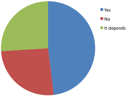
1. If you follow a museum on twitter, do you want it to follow you back?

Yes 49%
No 26.50%
It depends 26.50%

13 further comments were given for 'it depends':

  • if they're conversational or broadcasting
  • I hope they do, they don't have to.
  • Depends on what the account is doing. If it's just sending out announcements, who cares if it follows you back? If they're actually using Twitter, and there's an actual person back there somewhere doing something interesting, I'd be pleased if they decided to follow me, like any other user.
  • Of couirse I'd like it, but I understand if they don't due to over-following capacity!
  • If the museum is going to engage w/ me then yes; if it's just to broadcast I'm on the fence
  • I'm an art historian, so if an art museum started to follow me, I would be flattered! But if another kind of museum followed me, I would be slightly confused. So I think it would depend entirely on the profession of the person and if they use their account in a professional way
  • If they start wanting to be my best bud, I'd probably get creeped out and block them.
  • I wouldn't mind being followed, but not as a data point in a marketing database or to get impersonal spam.
  • I don't think I really have a strong view either way.
  • Why?
  • If I've started a discussion with said museum through twitter
  • Don't mind either way in most cases
  • it has no material effect — I don't gain anything from it following me.
I also posted the question on Facebook, and two people said it was weird. One went further, "I think it's weird, unless you primarily tweet about museums. I assume that anyone following me that is following more than 200 people doesn't actually read my tweets.".

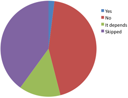
2. If you follow a museum on twitter, do you mind if it follows you back?

Yes 2%
No 44%
It depends 14%
Skipped 40%
[See note above about the number of 'skipped' responses]

7 further comments were given for 'it depends':

  • I'd rather be able to look at who you follow to find other twitterers of interest. Can't do that if you follow thousands of people back. Be selective so we can look thru them.
  • not unless my tweet is museum related
  • It depends on whether I know who is behind the tweets. Being a museum professional, sometimes they are colleagues, and that's okay with me.
  • I don't really care, but I think it's silly.
  • I just don't see why they would, it doesn't help either of us
  • See above :)
  • I would prefer it to follow back, especially if it's relevant to my own areas of historical interest, but no one has to follow anyone they don't want to.

So it looks like you can't win – almost 50% of new followers expect you to follow them and 50% either don't, or only do under some circumstances.  As you can see from the responses to questions 3 and 4 (below), the results have presumably been skewed as 50% of respondents have a close involvement with museums, and a whopping two-thirds have a professional or academic interest in social media. I'm using the free version of SurveyMonkey so can't easily split out the 'social media' or 'museum professional' responses from the rest to see if people who are neither have different views on reciprocal following.

The only way to get a sense of whether followers of your particular museum account expect to be followed back, or mind being followed back, may be to ask them directly.

Of the people who were able to answer question 2, a very small minority unequivocally minded being followed by a museum account, but 44% of those who answered don't mind if a museum account doesn't follow them back.

Another interesting question would have been 'is it friendly or weird if an organisation follows you after you mention them?' – if you do any more research into the issue, let me know.

Question 6 asked for 'Any other comments?'.

  • Though I don't work in a museum, I work in or with museums. I think the main issue is that museums tweeting should have personality, you should feel it's a person (or group of people) that want to engage with you. I think if they follow me, it's more likely they will hear me and engage.
  • By following and being followed by a museum it creates a sense of community (although of course I realize the museums won't have time to read all the tweets).
  • I run a twitter account on behalf of a library, and think it's good manners to follow back someone who follows you (like returning a hello). I always try to reply to people who want to talk to us, but try not to butt into conversations that are *about* us, but which don't want us to reply to them (this can be tricky). As a user, by and large – I only want to talk to museums when I know the people doing the tweeting – and in New Zealand, I know most of these people anyway. Internationally, I do the same thing. Courtney Johnston, @auchmill, @nlnz
  • I like when museums respond to my comments or @ replies, but I'm not as comfortable with them following me. Being responsive is different than following.
  • Twiter has become one of the best sources for professional info & contacts @innova2
  • It would be more useful for the museum to keep track of hashtags, etc.
  • I want to communicate with people I follow, so following me back makes it easier. I don't expect them to read all/most of what I say, but it's nice…especially on my protected account (otherwise they never see the @)
  • Museums rock!
  • I don't really mind either way. I find it flattering if an institution wants to follow me. They must think I have something to say!
  • I feel that museums have a great opp to get more individuals involved in history and the arts via social media – personally I follow a few and am always pleased to hear about new exhibits, events, etc.
  • I work with museums, that's why I would like them to follow me back. I use Twitter for work, so I don't mind if they follow back. If I would talk to my friends over Twitter about private stuff maybe I WOULD mind….
  • If a museum (or anyone) didn't follow back, I would probably unfollow after a while unless their tweets were really something special.
  • I want people/institutions to follow me if they have genuine interest in my tweets – the same criteria I apply when choosing who to follow myself!
  • The real question probably should have been (or maybe an additional question should have been): do you MIND if a museum you follow follows you back. Because really, I don't necessarily want them to, but I don't mind if they do. I have the power to block if need be.
  • I think if the Museum was clear about WHY it was following me on twitter it would be less "stalkerish". In general I somewhat expect to be followed by those I am following. Although I am not sure if organizations (Museums) really need to follow individuals. I would imagine the Museum's staff would be overwhelmed with the number of completely unrelated tweets. What would be the advantage that couldn't be obtained better by simply searching twitter for key terms related to the museum, content, exhibit, etc? (Note: I do not work "in" a museum but have worked with over 6 museums to define and develop their websites and web marketing activities)
  • I manage a twitter feed for a project at a science center. I follow people, organizations and businesses that are in the service area for the project (a watershed). I also follow other organizations that are working on similar issues (water quality).
  • I think not following people back is poor Twitter etiquette. That is like saying to someone, "Listen to me! But I won't listen to you!"
  • 1. Personally, I find follow bots mildly more insulting than not being followed back. 2. In my professional capacity tweeting for a museum, if someone @mentions us, I follow them (I consider it friendly). The fact that this could be done equally well (and more efficiently) by a bot disturbs me a bit.
  • I tweet with an interest in culture, art, and museums in mind. It's more of a compliment for museums to follow back than a feeling of being stalked, as it shows interest in its reader's tweets.
  • Leave the poor souls alone, they only want to know what's going on at your museum. I've blocked Museum of London (and I have every reason to trust them. Or not)
  • How is it stalkerish…dumb survey
  • Happy to be followed if it would help the museum understand more about its audience  
So that's that.   I thought 'being responsive is different than following' summed things up quite nicely, but whatever your view, some interesting opinions have been expressed above.
I hadn't considered before that not following someone back was rude – I must appear terribly rude on my personal accounts but I just can't keep up with so many accounts, especially as I can have lots of time away from the keyboard.

Finally, the demographic questions (kept brief to keep the survey short)
3. Do you work, study or volunteer in a museum?
Yes 56%
No 44%

4. Do you work, study or volunteer in social media?
Yes 68%
No 32%

5. Where in the world are you?

Countries Total respondents
Australia 2
Belgium 1
Canada 2
Germany 1
Netherlands 4
New Zealand 1
Norway 1
Spain 2
Switzerland 1
UK 17
USA 18

If you follow a museum on twitter, is it friendly or weird if it follows you back?

Another Quick and Dirty Completely Unscientific Survey [tm].  Today was #followamuseum day on Twitter, and it's all lovely and stuff, but I noticed some comments tagged #followavisitor #followamember or #MuseumsFollowYouBack suggesting that museums should follow you back. Now, I personally hate it* when an institution I've followed or mention follows me – particularly when I've only mentioned them in twitter conversation and not actually directed a comment at their username.  Ugh, creepy.

So we clearly have two different sets expectations about our relationships with institutional accounts. I wanted to know what the expectations 'out there' were, so I whipped up a quick survey and tweeted it, asking 'Friendly or stalkerish?'.  I've also asked the question on Facebook, where my network is much less museum-y and social network-y**. You can go add your opinion now: http://www.surveymonkey.com/s/CSVXVCM

A supplementary question I didn't add: "if a museum follows you back, do you really think they have time to read your tweets, or just respond to @ replies?"

* nearly all the time, anyway. I'd never think 'ooh, they're interested in me as an individual', even though, y'know, I'm really interesting and stuff.

** You can tell, because my brother thought it was hilarious to respond: "You should go further and, whenever anyone visits the museum, pay them a return visit to check out all the stuff at their place. Imagine that! They'll love it!", but someone, somewhere, is adding that to their museum marketing plan.

Unintentional (?) Friday funny

It's a long time since I had one of these. I can go on blaming uni assessments and work, but it gets boring.

I assume it's not intentional, but this Guardian article A world of screens and plastic has fed a cultish craving for relics of the past is hilarious, and beautifully quotable. As Linda Spurdle tweeted: 'I missed this training day! "Museum staff are trained to behave as acolytes to their objects.." prob stuck on H & S day'.

On the BBC/BM 'A History of the World': "Since this is radio, we are not allowed to see the objects, thus enhancing the status of their custodian as interceding priest. … Authenticity is essential and there must be no copies or representations – in ­MacGregor's case not so much as a ­picture." Well, you could look online.

And if is to be true "[i]t does not matter if no one ever sees the shard. Most museum objects are seen only by their guardians, albeit financed by tithes from taxpayers", we'd probably better hide the 230,000 Science Museum, National Railway Museum and National Media Museum objects online. On the other hand, I do like a good 'museum as church' argument, cos if it was true the office wouldn't have bundles of excited kids on the other side of the door and it might be be quieter.

On a more serious note, whenever I come across articles like this it reminds me how far we have to go in helping people realise exactly how accessible, enjoyable, potentially challenging and just plain interesting our (your, their) museums are.

What do you mean by 'wireframe'?

This post on 'The future of wireframes?' chimed a few bells, not only because I'm revising for a Requirements Engineering exam but because I've been in the start-up phase for projects of all sizes lately and have been thinking hard about the best way to understand and communicate requirements. In doing so, I've realised that 'wireframes' has become one of those terms that mean different things to different people – and that of course, it's an entirely new term to people who haven't worked on a design phase of a digital project before. This summed up past and current definitions neatly:

For many years the primary role of wireframes was to specify software. We now use wireframes to investigate and explore how people will interact with a site. Using a ‘just enough’ approach, we often create a series of simple interactive prototypes to try out a variety of approaches to solving a problem. These prototypes can be made in HTML or they can be as simple as a series of Keynote slide for someone to click through.

This is a very different approach to wireframing. Rather than simply documenting where a link goes, the goal is to model and start experiencing what moving around a site feels like as quickly as possible. The prototype can then be tested and the results used to iteratively improve the end solution.

Of course, sites still need to be specified, but wireframes aren’t always the right tool for doing this.

Here's a list of wireframe and prototype tools – do you have any favourites?

A rare post from me – I've been completely caught up in work and my MSc for the past few months. Normal service will be resumed soon – I've still got to report on UKMW09 and a trip to Oslo to give a lecture on social media and museums, libraries and archives.

Nine days to go! And entering Cosmic Collections just got easier

Quoting myself over on the museum developers blog, Cosmic Collections – do one thing and do it well:

I’ve realised that there may be some mismatch between the way mashups tend to work, and the scope we’ve suggested for entries to our competition. The types of interfaces someone might produce with the API may lend themselves more to exploring one particular idea in depth than produce something suitable for the broadest range of our audiences.

So I’m proposing to change the scope for entries to the competition, to make it more realistic and a better experience for entrants: I’d like to ask you to build a section of a site, rather than a whole site. The scope for entrants would then be: “create something that does one thing, and does it well”. Our criteria – use of collections data, creativity, accessibility, user experience and ease of deployment and maintenance – are still important but we’ll consider them alongside the type of mashup you submit.

I've updated the Cosmic Collections competition page to reflect this change. This page also features a new 'how to take part' section, including a direct link to the API and to a discussion group.

I'd love to hear your thoughts on this change – there's an email address lurking on the competition page, and I'm on twitter @mia_out and @coscultcom.

In other news, programmableweb published a blog post about the competition today: Science Museum Opens API and Challenges Developers to Mashup the Cosmos. Woo!

And I don't know if it's any kind of consolation if you're entering, but I'll be working right alongside you up until Friday 28th, on an assignment for my MSc.