Modern elections are data visualisation bonanzas, and the 2015 UK General Election is no exception.
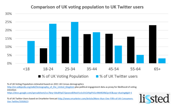
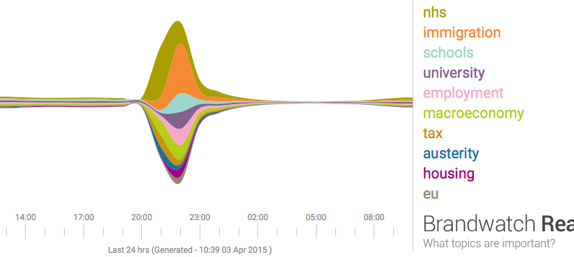
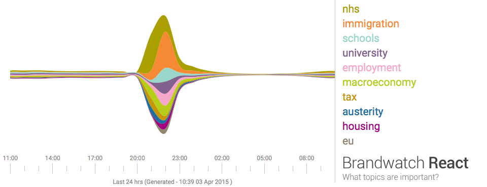
Last night seven political leaders presented their views in a televised debate. This morning the papers are full of snap polls, focus groups, body language experts, and graphs based on public social media posts describing the results. Graphs like the one below summarise masses of text using a technique called 'sentiment analysis', a form of computational language processing.* After a twitter conversation with @benosteen and @MLBrook I thought it was worth posting about the inherent biases in the tools that create these visualisations. Ultimately, 'sentiment analysis' is someone's opinion turned into code – so whose opinion are you seeing?
This is a great time to remember that sentiment analysis – mining text to see what people are talking about and how they feel about it – is based on algorithms and software libraries that were created and configured by people who've made a series of small, accumulative decisions that affect what we see. You can think of sentiment analysis as a sausage factory with the text of tweets as the mince going in one end, and pretty pictures as the product coming out the other end. A healthy democracy needs the list of secret ingredients added during processing, not least because this election prominently features spin rooms and party lines.
What are those 'ingredients'? The software used for sentiment analysis is 'trained' on existing text, and the type of text used affects what the software assumes about the world. For example, software trained on business articles is great at recognising company names but does not do so well on content taken from museum catalogues (unless the inventor of an object went on to found a company and so entered the trained vocabulary). The algorithms used to process text change the output, as does the length of the phrase analysed. The results are riddled with assumptions about tone, intent, the demographics of the poster and more.
In the case of an election, we'd also want to know when the text used for training was created, whether it looks at previous posts by the same person, and how long the software was running over the given texts. Where was the baseline of sentiment on various topics set? Who defines what 'neutral' looks like to an algorithm?
We should ask the same questions about visualisations and computational analysis that we'd ask about any document. The algorithmic 'black box' is a human construction, and just like every other text, software is written by people. Who's paying for it? What sources did they use? If it's an agency promoting their tools, do they mention the weaknesses and probable error rates or gloss over it? If it's a political party (or a company owned by someone associated with a party), have they been scrupulous in weeding out bots? Do retweets count? Are some posters weighted more heavily? Which visualisations were discarded and how did various news outlets choose the visualisations they featured? Which parties are left out?
It matters because, all software has biases, and, as Brandwatch say, 'social media will have a significant role in deciding the outcome of the general election'. And finally, as always, who's not represented in the dataset?
* If you already know this, hopefully you'll know the rest too. This post is deliberately light on technical detail but feel free to add more detailed information in the comments.
One thing that might stand out when we look back at 2014 is the rise of interpolated content. We've become used to translating around auto-correct errors in texts and emails but we seem to be at a tipping point where software is going ahead and rewriting content rather than prompting you to notice and edit things yourself.
iOS doesn't just highlight or fix typos, it changes the words you've typed. To take one example, iOS users might use 'ill' more than they use 'ilk', but if I typed 'ilk' I'm not happy when it's replaced by an algorithmically-determined 'ill'. As a side note, understanding the effect of auto-correct on written messages will be a challenge for future historians (much as it is for us sometimes now).
And it's not only text. In 2014, Adobe previewed GapStop, 'a new video technology that eases transitions and removes pauses from video automatically'. It's not just editing out pauses, it's creating filler images from existing images to bridge the gaps so the image doesn't jump between cuts. It makes it a lot harder to tell when someone's words have been edited to say something different to what they actually said – again, editing audio and video isn't new, but making it so easy to remove the artefacts that previously provided clues to the edits is.
Photoshop has long let you edit the contrast and tone in images, but now their Content-Aware Move, Fill and Patch tools can seamlessly add, move or remove content from images, making it easy to create 'new' historical moments. The images on extrapolated-art.com, which uses '[n]ew techniques in machine learning and image processing […] to extrapolate the scene of a painting to see what the full scenery might have looked like' show the same techniques applied to classic paintings.
But photos have been manipulated since they were first used, so what's new? As one Google user reported in It’s Official: AIs are now re-writing history, 'Google’s algorithms took the two similar photos and created a moment in history that never existed, one where my wife and I smiled our best (or what the algorithm determined was our best) at the exact same microsecond, in a restaurant in Normandy.' The important difference here is that he did not create this new image himself: Google's scripts did, without asking or specifically notifying him. In twenty years time, this fake image may become part of his 'memory' of the day. Automatically generated content like this also takes the question of intent entirely out of the process of determining 'real' from interpolated content. And if software starts retrospectively 'correcting' images, what does that mean for our personal digital archives, for collecting institutions and for future historians?
Interventions between the act of taking a photo and posting it on social media might be one of the trends of 2015. Facebook are about to start 'auto-enhancing' your photos, and apparently, Facebook Wants To Stop You From Uploading Drunk Pictures Of Yourself. Apparently this is to save your mum and boss seeing them; the alternative path of building a social network that don't show everything you do to your mum and boss was lost long ago. Would the world be a better place if Facebook or Twitter had a 'this looks like an ill-formed rant, are you sure you want to post it?' function?
So 2014 seems to have brought the removal of human agency from the process of enhancing, and even creating, text and images. Algorithms writing history? Where do we go from here? How will we deal with the increase of interpolated content when looking back at this time? I'd love to hear your thoughts.
If you've ever wondered who's using content from your site or what people find interesting, here are some ways to find out, using the Design Museum's URL as an example.
Twitter – search for the URL with quotes around it e.g. "designmuseum.org"
If you can see one particular page shooting up in your web stats, you could try a reverse image search on TinEye to see where it's being referenced.
What am I missing? I'd love to hear about similar links and methods for other sites – tell me in the comments or on twitter @mia_out.
Update: in a similar vein, Tim Sherratt @wragge launched a new experiment called Trove Traces the same day, to 'explore how Trove newspapers are used' by listing pages that link to articles: http://trovespace.webfactional.com/traces/
A quick post triggered by an article on the role of domain knowledge (knowledge of a field) in critical thinking, Deep in thought:
Domain knowledge is so important because of the way our memories work. When we think, we use both working memory and long-term memory. Working memory is the space where we take in new information from our environment; everything we are consciously thinking about is held there. Long-term memory is the store of knowledge that we can call up into working memory when we need it. Working memory is limited, whereas long-term memory is vast. Sometimes we look as if we are using working memory to reason, when actually we are using long-term memory to recall. Even incredibly complex tasks that seem as if they must involve working memory can depend largely on long-term memory.
When we are using working memory to progress through a new problem, the knowledge stored in long-term memory will make that process far more efficient and successful. … The more parts of the problem that we can automate and store in long-term memory, the more space we will have available in working memory to deal with the new parts of the problem.
There's a long history of hard-won wisdom, design patterns and knowledge (whether about ways not to tender for or specify software, reasons why proposed standards may or may not work, translating digital methods and timelines for departments raised on print, etc – I'm sure you all have examples) contained in the individual and collective memory of individual technologists and teams. Some of it is represented in museum technology mailing lists, blogs or conference proceedings, but the lessons learnt in the past aren't always easily discoverable by people encountering digital heritage issues for the first time. And then there's the issue of working out which knowledge relates to specific, outdated technologies and which still holds while not quashing the enthusiasm of new people with a curt 'we tried that before'…
Something in the juxtaposition of the 20th anniversary of BritPop and the annual wave of enthusiasm and discovery from the international Museums and the Web (#MW2014) conference prompted me to look at what the Museums Computer Group (MCG) and Museum Computer Network (MCN) lists were talking about in April five and ten years ago (i.e. in easily-accessible archives):
Some of the conversations from that random sample are still highly relevant today, and more focused dives into various archives would probably find approaches and information that'd help people tackling current issues.
So how can we help people new to the sector find those previous conversations and get some of this long-term memory into their own working memory? Pointing people to search forms for the MCG and MCN lists is easy, some of the conference proceedings are a bit trickier (e.g. search within the museumsandtheweb.com) and there's no central list of museum technology blogs that I know of. Maybe people could nominate blog posts they think stand the test of time, mindful of the risk of it turning into a popularity/recency thing?
If you're new(ish) to digital heritage, how did you find your feet? Which sites or communities helped you, and how did you find them? Or if you have a new team member, how do you help them get up to speed with museum technology? Or looking further afield, which resources would you send to someone from academia or related heritage fields who wanted to learn about building heritage resources for or with specialists and the public?
I've just spent a week in Melbourne (my home town, awww) for VALA2014. VALA is about 'libraries, technology and the future' and the conference theme for 2014 was 'streaming with possibilities'. Kim Tairi's briefing (as Chair of the VALA2014 Conference Programme Committee) included the phrases 'stories that will ignite, challenge and excite our audience' and 'don’t be afraid to be controversial or push the boundaries', which was a brilliant challenge and turned out to be a great introduction to the ethos of the conference.
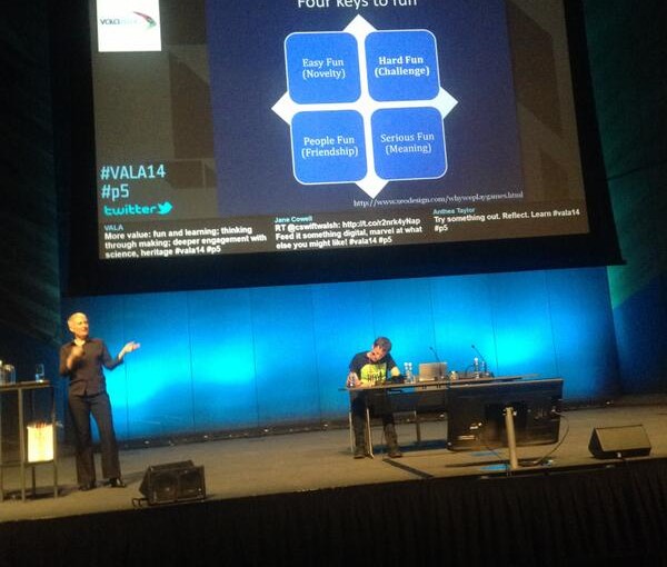
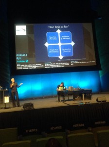
My keynote was on 'Bringing maker culture to cultural organisations'. From my abstract: Should museums, libraries and archives be places for looking at old stuff other people have made, or could they also be places where new creations are inspired and made? If making – writing, designing, building – is the deepest level of engagement with heritage and culture, how can memory institutions avoid the comforting but deadly trap of broadcasting at the public and instead create spaces for curating, creating or conversing with them? Somehow that meant a romp through banana pianos, the link between knitting and historic newspapers, why I like coding, the value of tinkering, secret shoppers and the fact that everyone is a maker of some sort (or was in the past).
I'm sharing my slides below, but Slideshare seems to have stopped including the speaker notes so they're best viewed in conjunction with either of the two blog posts about my keynote that appeared with impressive speed or the tweets from my session. I've storified the tweets at Tweets from keynote 'Bringing maker culture to cultural organisations' at VALA14 – the audience did a fantastic job of summarising my speech, adding their own questions and comments, and sharing links to the sites and projects I mentioned. Yay, librarians! The two posts are Deborah '@deborahfitchett' Fitchett's Bringing maker culture to cultural organisations and Richard '@penanghill' Hayward's Mia Ridge on the Maker Movement (on an unrelated-but-home town note, Richard was my boss many, many years ago!).
Huge thanks to the organisers for the invitation to speak, to the conference staff for making everything run so smoothly, to the other keynotes for their inspiration and to the attendees for being such good sports.
Hands up if someone you know gave or received a mobile phone or tablet over the holidays? And how long was it before they snuck away to quietly checked their favourite social networks or the sales with their new device? Some people will end up on a cultural heritage site. Sometimes it's because they now have a device to hand to look up random questions that arise while they're watching Downton Abbey or they're looking for entertainment for future commutes; others might try booking tickets for a show from their kitchen or keeping the kids quiet with a few games.
What will they see when they hit your site? Will the games and interactives have disappeared for Apple devices without Flash, will they struggle to fill in forms on your non-responsive site – or will they be welcomed to a site optimised for their device?
Of course the short answer is, yes, Christmas (and the past few years) have changed how audiences see your website. This post is a guide to using Google Analytics to put numbers against that statement and working out where you need to improve the experience for visitors on mobiles and tablets, but if you don't have access to Google Analytics then just assume lots of visitors are on mobile and make sure your site will work for them. There's no substitute for trying to perform typical visitor tasks with real devices, but emulators for iPads, tablets, TVs, mobiles, responsive design, etc can help you get started. And if you're promoting content on social media and don't have a mobile/tablet ready site, then you're effectively inviting people over then slamming the door in their face, so just fix your site already.
If you do have access to Google Analytics, here are some tips for assessing the impact of all that gift-giving and working out the velocity of change in mobile and tablet visits on your site to understand what you're facing in the coming year (and getting to grips with Analytics while you're at it). Understanding how quickly your audience is changing and what people are doing on your site will a) help you decide which key tasks and sections to test with actual devices, PageSpeed Insights etc, and b) prioritise technical changes in the immediate future.
View mobile and tablet visits with built-in Google Analytics Segments and custom date ranges
The simplest way to assess how much of your website traffic is from mobile or tablet devices is to navigate to the Audiences/Mobile/Overview report, then click on the dates on the top right-hand corner and set the left-hand date to a year or two in the past and the right-hand date to now. You'll probably see a gradual increase in total visits over time, and some information underneath that about the total numbers of visits from 'desktop', 'mobile' and 'tablet' devices.
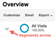
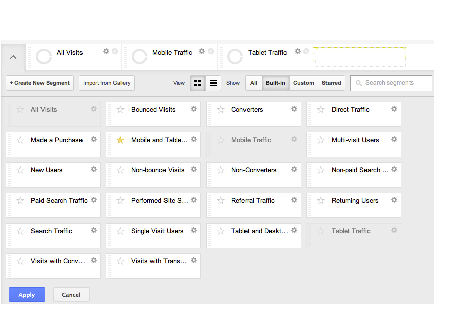
For a more useful breakdown of the number of desktop, mobile and tablet devices over time on other reports – whether Content reports like popular, Landing and Exit pages, location ('geo') or how people got to your site (aka 'acquisition') – you need to apply some Segments. To open the Segments option box, click the small down arrow next to 'All visits', as in the screenshot.
This will open a screen (below) showing a range of built-in segments. For now, click 'Mobile Traffic' and 'Tablet Traffic' to add them to the selected Segments list. Click 'Apply' and view the breakdown of visits by device over time. Hover over the lines for more detail. You can change reports and the segments will stay selected until you unselect them. (For later: explore other built-in segments, and learn how to make your own to answer questions that matter to your organisation.)
Tips: viewing stats by week rather than by day can help any patterns stand out more clearly. If you get a lot of traffic overall, you'll be able to see the difference in mobile/tablet visits more clearly if you take out the 'All Visits' segment.
Using the built-in date range fields to compare change over time
One of the key pieces of work I did for the Culture24 Let's Get Real project involved calculating the 'velocity' of change in mobile visits for a range of museums and arts organisations (see Section 8, 'Understanding mobile behaviours' in the project report). If you want to get a sense of how quickly your audience is changing (e.g. to make a case for resources), you can compare two date ranges.
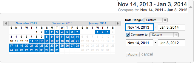
First, click the date range on the top right-hand corner to open the custom date options. Enter a date range that covers a period before and after the holidays, then tick 'Compare to: Previous Period' and add the same dates for an earlier year there. Tip: copying and pasting then changing the dates is quicker than navigating to them via the left-hand side calendar.
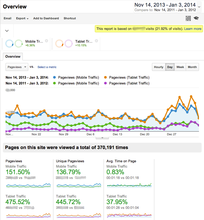
The screenshot below shows the results on the Behaviour Overview report, including key indicators like the increase in time-on-site on tablets and the overall increase in visits from mobiles and tablets. As you can see, both mobile and tablet traffic is higher in the past week. This may even out as people head back to work, but the only way you'll know is by looking at your own stats.
Tips: if there are odd spikes or gaps in your stats, you might want to pick your dates around them (or add an explanatory annotation). If you have the data, try comparing the same time of year over e.g. 2011/12 to see the difference a couple of years have made. If you want to dive into the numbers to understand the devices more, the 'Browser & OS' report is useful, or explore the 'Primary Dimensions' on the 'Devices' report.
Learn Analytics by answering questions specific to your site
Working with participants in the Let's Get Real project reminded me that having a specific question to answer is a good way to find your way through the mass of options in Google Analytics, so for bonus points, pick one or two of these to answer:
What traffic was there to your website on Christmas Day?
How did they get there and what were they looking at?
What kinds of transactions or interactions have people attempted on your site in the last six weeks?
Where do you lose people? Does it vary by device or is another factor more important?
On which pages or site sections do tablet visitors spend the most time? What about mobile visitors?
Was the increase in device usage larger this holiday or in previous years?
And following a comment from the Guardian's Tom Grinsted, how do visit demographics differ on weekends/weekdays? What about morning/daytime/evening visits?
Conversations at last month's Sustainable History: Ensuring today's digital history survives event [my slides] (and at the pub afterwards) touched on saving the data underlying websites as a potential solution for archiving them. This is definitely better than nothing, but as a human-computer interaction researcher and advocate for material culture in historical research, I don't think it's enough.
Just as people rue the loss of the information and experiential data conveyed by the material form of objects when they're converted to digital representations – size, paper and print/production quality, marks from wear through use and manufacture, access to its affordances, to name a few – future researchers will rue the information lost if we don't regard digital interfaces and user experiences as vital information about the material form of digital content and record them alongside the data they present.
Can you accurately describe the difference between using MySpace and Facebook in their various incarnations? There's no perfect way to record the experience of using Facebook in December 2013 so it could be compared with the experience of using MySpace in 2005, but usability techniques like screen-recording software linked to eyetracking or think-aloud tests would help preserve some of the tacit knowledge and context users bring to sites alongside the look-and-feel, algorithms and treatments of data the sites present to us. It's not a perfect solution, but a recording of the interactions and designs from both sites for common tasks like finding and adding a friend would tell future researchers infinitely more about changes to social media sites over eight years than simple screenshots or static webpages. But in this case we're still missing the notifications on other people's screens, the emails and algorithmic categorisations that fan out from simple interactions like these…
Even if you don't care about history, anyone studying software – whether websites, mobile apps, digital archives, instrument panels or procedural instructions embedded in hardware – still needs solid methods for capturing the dynamic and subjective experience of using digital technologies. As Lev Manovich says in The Algorithms of Our Lives, when we use software we're "engaging with the dynamic outputs of computation; studying software culture requires us to "record and analyze interactive experiences, following individual users as they navigate a website or play a video game … to watch visitors of an interactive installation as they explore the possibilities defined by the designer—possibilities that become actual events only when the visitors act on them".
The Internet Archive does a great job, but in researching the last twenty years of internet history I'm constantly hitting the limits of their ability to capture dynamic content, let alone the nuance of interfaces. The paradox is that as more of our experiences are mediated through online spaces and the software contained within small boxy devices, we risk leaving fewer traces of our experiences than past generations.
I've realised that it could be useful to share my reading at the intersection of research software engineers/cultural heritage technologist/digital humanities, so at the end I've posted some links to current discussions or useful reference points and work to provide pointers to interesting work.
But first; notes from last week's workshop for research software engineers, an event for people who 'not only develop the software, they also understand the research that it makes possible'. The organisers did a great job with the structure (and provided clear instructions on running a breakout session) – each unconference-style session had to appoint a scribe and report back to a plenary session as well as posting their notes to the group's discussion list so there's an instant archive of the event.
Discussions included:
How do you manage quality and standards in training – how do you make sure people are doing their work properly, and what are the core competencies and practices of an RSE?
How should the research community recognise the work of RSEs?
Sharing Research Software
Routes into research software development – why did you choose to be an RSE?
I ended up in the 'How should the research community recognise the work of RSES?' session. I like the definition we came up with: 'research software engineers span the role of researchers and software engineers. They have the domain knowledge of researchers and the development skills to be able to represent this knowledge in code'. On the other hand, if you only work as directed, you're not an RSE. This isn't about whether you make stuff, it's about how much you're shaping what you're making. The discussion also teased out different definitions of 'recognition' and how they related to people's goals and personal interests; the impact of 'short-termism' and project funding on stable careers, software quality, training and knowledge sharing. Should people cite the software they use in their research in the methods section of any publications? How do you work out and acknowledge someone's contribution to on-going or collaborative projects – and how do you account for double-domain expertise when recognising contributions made in code?
I'd written about the event before I went (in Beyond code monkeys: recognising technologists' intellectual contributions, which relates it to digital humanities and cultural heritage work) but until I was there I hadn't realised the extra challenges RSEs in science face – unlike museum technologists, science RSEs are deeply embedded in a huge variety of disciplines and can't easily swap between them.
The event was a great chance to meet people facing similar issues in their work and careers, and showed how incredibly useful the right label can be for building a community. If you work with science+software in the UK and want to help work out what a research software engineer community might be, join in the RSE discussion.
If you're reading this post, you might also be interested in:
On Ant-Lions and Scholar-Programmers by Doug Reside – the emphasis is on scholars rather than programmers and it's also interesting for the differences between academia in the US and UK (though it doesn't directly address them)
Michael Widner's Towards a Front Page for the Digital Humanities #dhthis, because it's one of many posts discussing DHThis and because I forget that not everyone lives and breaths this: 'software is a form of writing/making with its own assumptions and affordances, we have a responsibility to critique the software'
In ye olden days, beacon fires were lit on hills to send signals between distant locations. These days we have blogs.
Two upcoming events suggest that academia is starting to recognise that specialist technologists – AKA 'research software engineers' or 'digital humanities software developers' – make intellectual contributions to research software, and further, that it is starting to realise the cost of not recognising them. In the UK, there's a 'workshop for research software engineers' on September 11; in the US there's Speaking in Code in November (which offers travel bursaries and is with ace people, so do consider applying).
But first, who are these specialist technologists, and why does it matter? The UK Software Sustainability Institute's 'workshop for research software engineers' says 'research software engineers … not only develop the software, they also understand the research that it makes possible'. In an earlier post, The Craftsperson and the Scholar, UCL's James Hetherington says a 'good scientific coder combines two characters: the scholar and the craftsperson'. Research software needs people who are both scholar – 'the archetypical researcher who is driven by a desire to understand things to their fullest capability' and craftsperson who 'desires to create and leave behind an artefact which reifies their efforts in a field': 'if you get your kicks from understanding the complex and then making a robust, clear and efficient tool, you should consider becoming a research software engineer'. A supporting piece in the Times Higher Education, 'Save your work – give software engineers a career track' points out that good developers can leave for more rewarding industries, and raises one of the key issues for engineers: not everyone wants to publish academic papers on their development work, but if they don't publish, academia doesn't know how to judge the quality of their work.
Over in the US, and with a focus on the humanities rather than science, the Scholar's Lab is running the 'Speaking in Code' symposium to highlight 'what is almost always tacitly expressed in our work: expert knowledge about the intellectual and interpretive dimensions of DH code-craft, and unspoken understandings about the relation of that work to ethics, scholarly method, and humanities theory'. In a related article, Devising New Roles for Scholars Who Can Code, Bethany Nowviskie of the Scholar's Lab discussed some of the difficulties in helping developers have their work recognised as scholarship rather than 'service work' or just 'building the plumbing':
"I have spent so much of my career working with software developers who are attached to humanities projects," she says. "Most have higher degrees in their disciplines." Unlike their professorial peers, though, they aren't trained to "unpack" their thinking in seminars and scholarly papers. "I've spent enough time working with them to understand that a lot of the intellectual codework goes unspoken," she says.
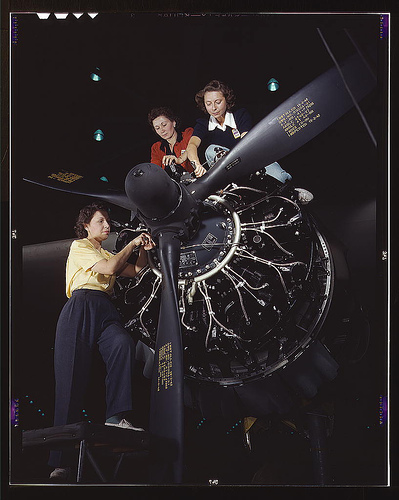
Women at work on C-47 Douglas cargo transport. LOC image via Serendip-o-matic
Digital humanists spend a lot of time thinking about the role of 'making things' in the digital humanities but, to cross over to my other domain of interest, I think the international Museums and the Web conference's requirement for full written papers for all presentations has helped more museum technologists translate some of their tacit knowledge into written form. Everyone who wants to present their work has to find a way to write up their work, even if it's painful at the time – but once it's done, they're published as open access papers well before the conference. Museum technologists also tend to blog and discuss their work on mailing lists, which provides more opportunities to tease out tacit knowledge while creating a visible community of practice.
I wasn't at Museums and the Web 2013 but one of the sessions I was most interested in was Rich Cherry and Rob Stein's 'What’s a Museum Technologist today?' as they were going to report on the results of a survey they ran earlier this year to come up with 'a more current and useful description of our profession'. (If you're interested in the topic, my earlier posts on museum technologists include On 'cultural heritage technologists', Confluence on digital channels; technologists and organisational change?, Museum technologists redux: it's not about us, Survey results: issues facing museum technologists.) Rob's posted their slides at What is a Museum Technologist Anyway? and I'd definitely recommend you go check them out. Looking through the responses, the term 'museum technologist' seems to have broadened as more museum jobs involve creating content for or publishing on digital channels (whether web sites, mobile apps, ebooks or social media), but to me, a museum technologist isn't just someone who uses technology or social media – rather, there's a level of expertise or 'domain knowledge' across both museums and technology – and the articles above have reinforced my view that there's something unique in working so deeply across two or more disciplines. (Just to be clear: this isn't a diss for people who use social media rather than build things – there's also a world of expertise in creating content for the web and social media). Or to paraphrase James Hetherington, "if you get your kicks from understanding the complex and then making a robust, clear and efficient tool, you should consider becoming a museum technologist'.
To further complicate things, not everyone needs their work to reflect all their interests – some programmers and tech staff are happy to leave their other interests outside the office door, and leave engineering behind at the end of the day – and my recent experiences at One Week | One Tool reminded me that promiscuous interdisciplinarity can be tricky. Even when you revel in it, it's hard to remember that people wear multiple hats and can swap from production-mode to critically reflecting on the product through their other disciplinary lenses, so I have some sympathy for academics who wonder why their engineer expects their views on the relevant research topic to be heard. That said, hopefully events like these will help the research community work out appropriate ways of recognising and rewarding the contributions of researcher developers.
Update: and already we've had feedback that people love the experience and have found it useful – it's so amazing to hear this, thank you all! We know it's far from perfect, but since the aim was to make something people would use, it's great to know we've managed that:
Update from Saturday morning – so this happened overnight:
Cool, Serendipmatic cloned and local dev version up and running in about 15 mins. Now to see about adding Trove to the mix. #owot — Tim Sherratt (@wragge) August 3, 2013
After five days and nights of intense collaboration, the One Week | One Tool digital humanities team has unveiled its web application: Serendip-o-matic <http://serendipomatic.org>. Unlike conventional search tools, this “serendipity engine” takes in any text, such as an article, song lyrics, or a bibliography. It then extracts key terms, delivering similar results from the vast online collections of the Digital Public Library of America, Europeana, and Flickr Commons. Because Serendip-o-matic asks sources to speak for themselves, users can step back and discover connections they never knew existed. The team worked to re-create that moment when a friend recommends an amazing book, or a librarian suggests a new source. It’s not search, it’s serendipity.
Serendip-o-matic works for many different users. Students looking for inspiration can use one source as a springboard to a variety of others. Scholars can pump in their bibliographies to help enliven their current research or to get ideas for a new project. Bloggers can find open access images to illustrate their posts. Librarians and museum professionals can discover a wide range of items from other institutions and build bridges that make their collections more accessible. In addition, millions of users of RRCHNM’s Zotero can easily run their personal libraries through Serendip-o-matic. Serendip-o-matic is easy to use and freely available to the public. Software developers may expand and improve the open-source code, available on GitHub. The One Week | One Tool team has also prepared ways for additional archives, libraries, and museums to make their collections available to Serendip-o-matic.
 This is a great time to remember that sentiment analysis – mining text to see what people are talking about and how they feel about it – is based on algorithms and software libraries that were created and configured by people who've made a series of small, accumulative decisions that affect what we see. You can think of sentiment analysis as a sausage factory with the text of tweets as the mince going in one end, and pretty pictures as the product coming out the other end. A healthy democracy needs the list of secret ingredients added during processing, not least because this election prominently features spin rooms and party lines.