How did 'play' shape the design and experience of creating Serendip-o-matic?

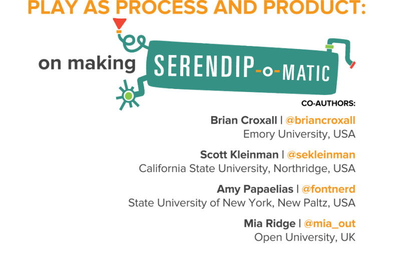
Here are my notes from the Digital Humanities 2014 paper on 'Play as Process and Product' I did with Brian Croxall, Scott Kleinman and Amy Papaelias based on the work of the 2013 One Week One Tool team.

Scott has blogged his notes about the first part of our talk, Brian's notes are posted as '“If hippos be the Dude of Love…”: Serendip-o-matic at Digital Humanities 2014' and you'll see Amy's work adding serendip-o-magic design to our slides throughout our three posts.

I'm Mia, I was dev/design team lead on Serendipomatic, and I'll be talking about how play shaped both what you see on the front end and the process of making it.

How did play shape the process?

The playful interface was a purposeful act of user advocacy – we pushed against the academic habit of telling, not showing, which you see in some form here. We wanted to entice people to try Serendipomatic as soon as they saw it, so the page text, graphic design, 1 – 2 – 3 step instructions you see at the top of the front page were all designed to illustrate the ethos of the product while showing you how to get started.

How can a project based around boring things like APIs and panic be playful? Technical decision-making is usually a long, painful process in which we juggle many complex criteria. But here we had to practice 'rapid trust' in people, in languages/frameworks, in APIs, and this turned out to be a very freeing experience compared to everyday work.
Serendip-o-matic_ Let Your Sources Surprise You.png
First, two definitions as background for our work…

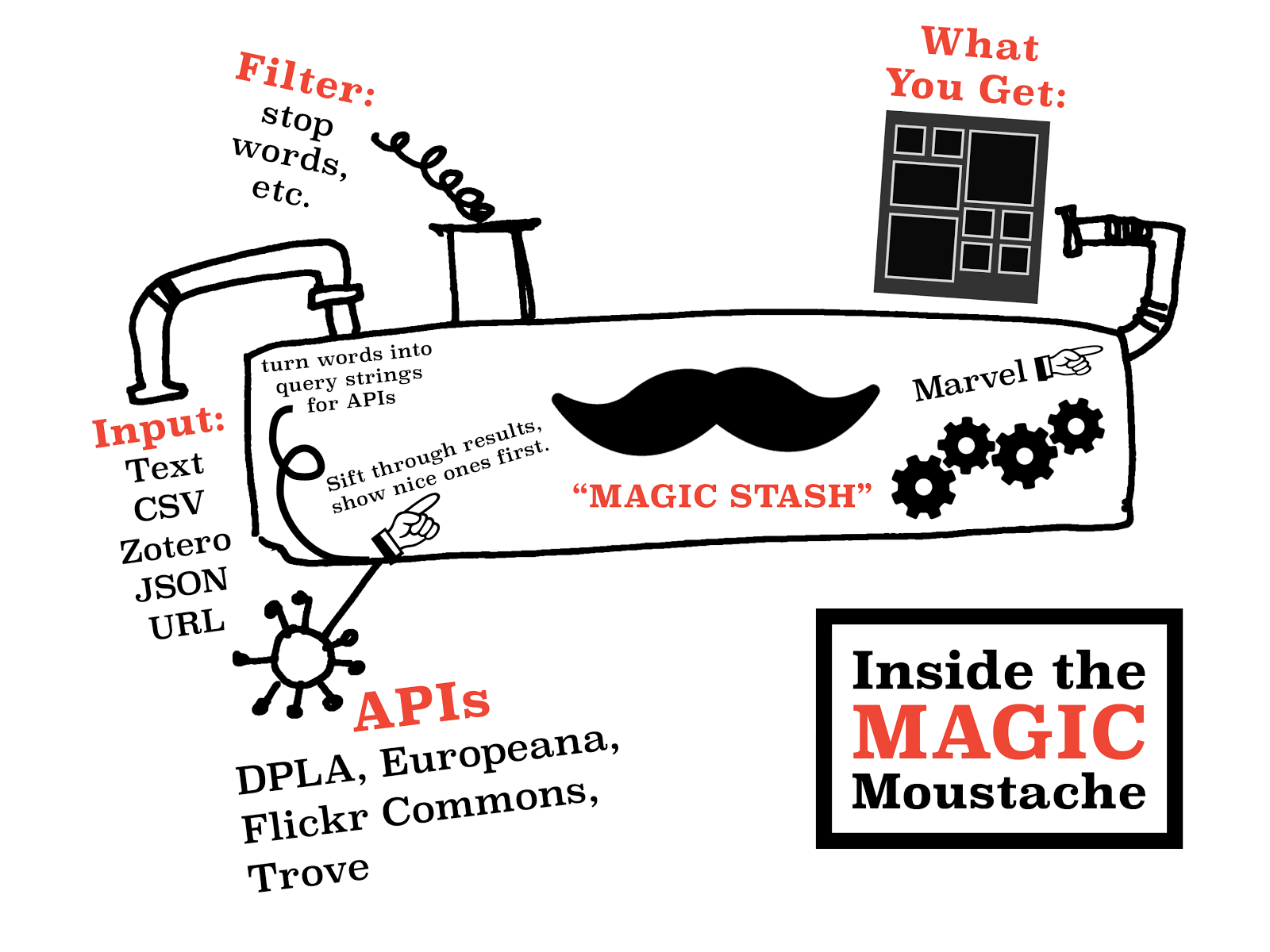
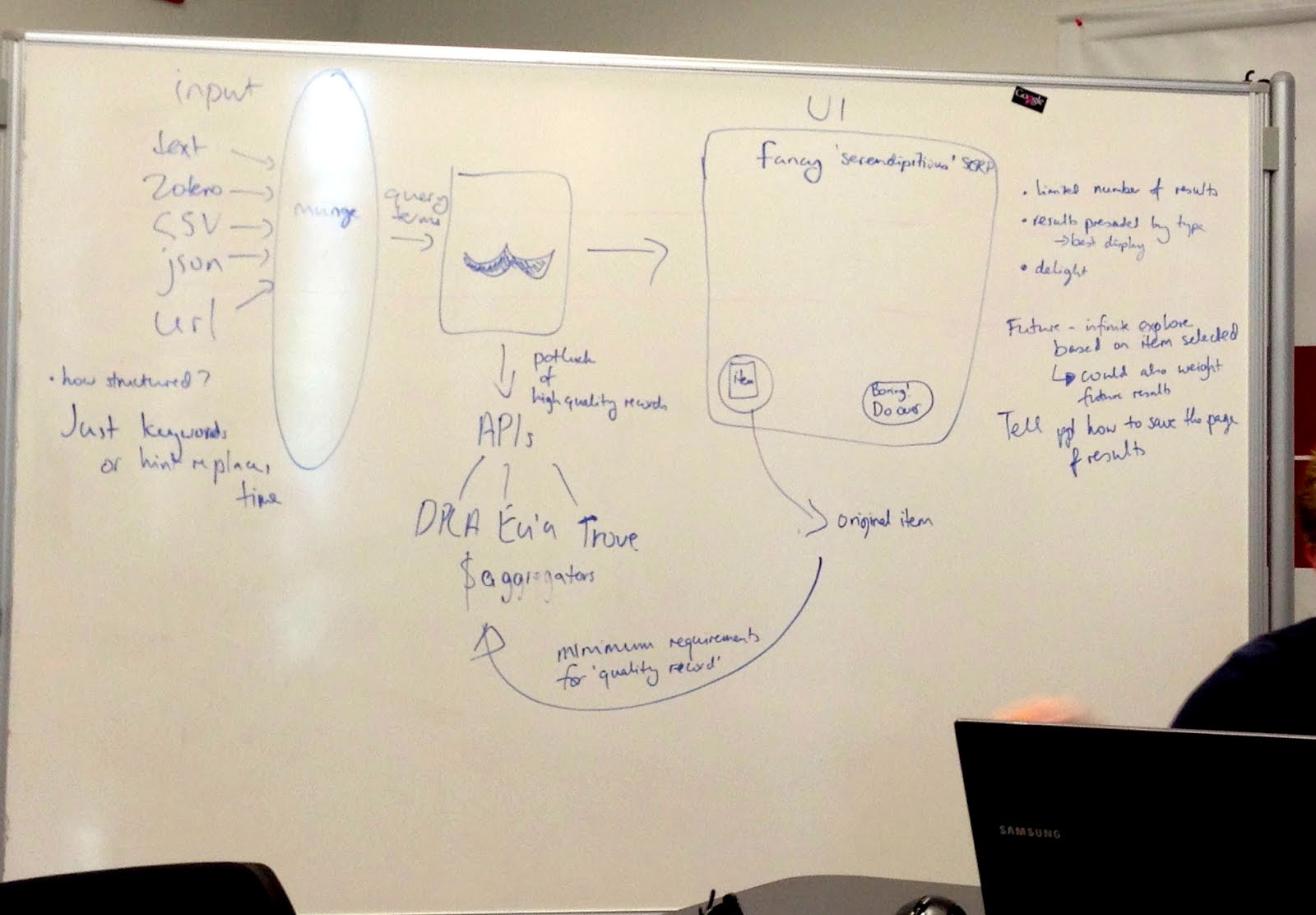
Just in case anyone here isn't familiar with APIs, APIs are a set of computational functions that machines use to talk to each other. Like the bank in Monopoly, they usually have quite specific functions, like taking requests and giving out information (or taking or giving money) in response to those requests. We used APIs from major cultural heritage repositories – we gave them specific questions like 'what objects do you have related to these keywords?' and they gave us back lists of related objects.
2013-08-01 10.14.45.jpg
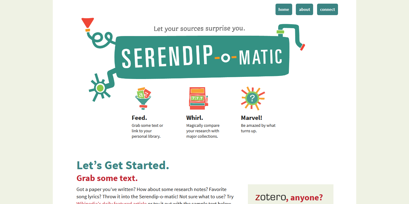
The term 'UX' is another piece of jargon. It stands for 'user experience design', which is the combination of graphical, interface and interaction design aimed at making products both easy and enjoyable to use. Here you see the beginnings of the graphic design being applied (by team member Amy) to the underlying UX related to the 1-2-3 step explanation for Serendipomatic.

Feed.

serendipomatic_presentation p9.png
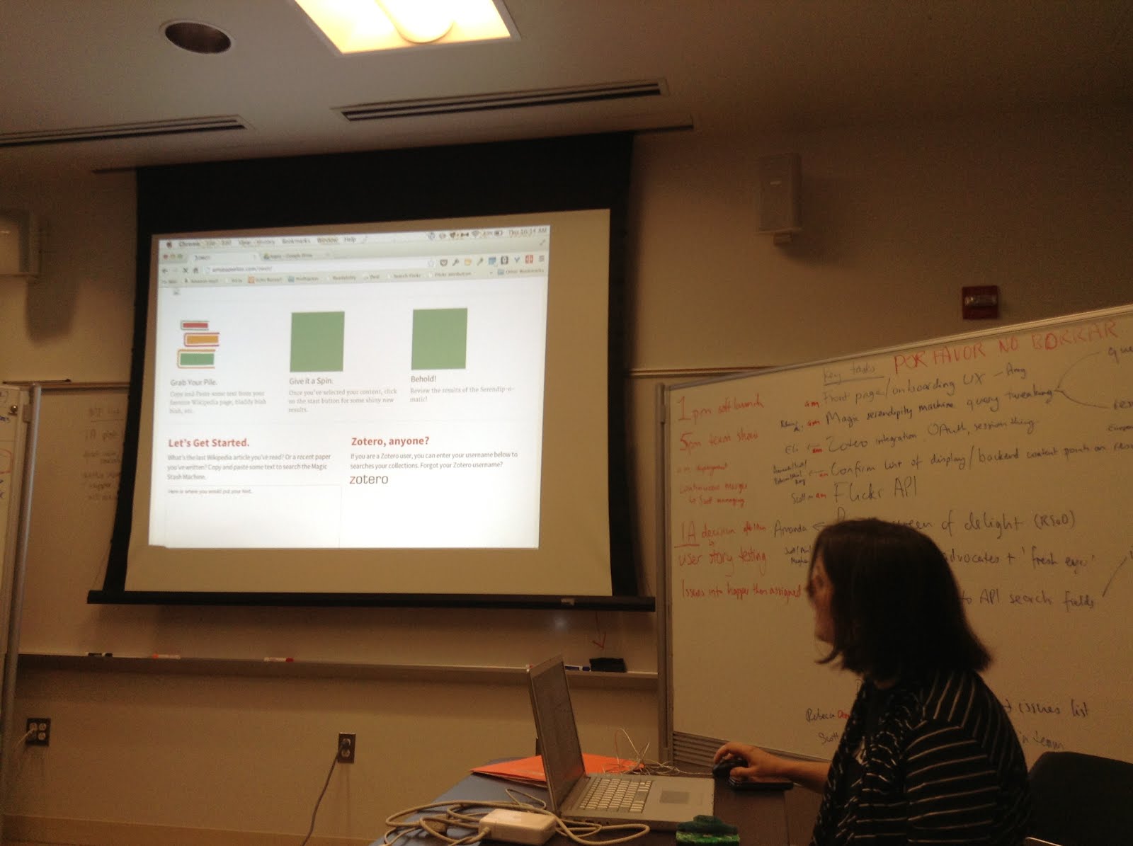
The 'feed' part of Serendipomatic parsed text given in the front page form into simple text 'tokens' and looked for recognisable entities like people, places or dates. There's nothing inherently playful in this except that we called the system that took in and transformed the text the 'magic moustache box', for reasons lost to time (and hysteria).

Whirl.

These terms were then mixed into database-style queries that we sent to different APIs. We focused on primary sources from museums, libraries, archives available through big cultural aggregators. Europeana and the Digital Public Library of America have similar APIs so we could get a long way quite quickly. We added Flickr Commons into the list because it has high-quality, interesting images and brought in more international content. [It also turns out this made it more useful for my own favourite use for Serendipomatic, finding slide or blog post images.] The results are then whirled up so there's a good mix of sources and types of results. This is the heart of the magic moustache.

Marvel.

User-focused design was key to making something complicated feel playful. Amy's designs and the Outreach team work was a huge part of it, but UX also encompasses micro-copy (all the tiny bits of text on the page), interactions (what happened when you did anything on the site), plus loading screens, error messages, user documentation.

We knew lots of people would be looking at whatever we made because of OWOT publicity; you don't get a second shot at this so it had to make sense at a glance to cut through social media noise. (This also meant testing it for mobiles and finding time to do accessibility testing – we wanted every single one of our users to have a chance to be playful.)


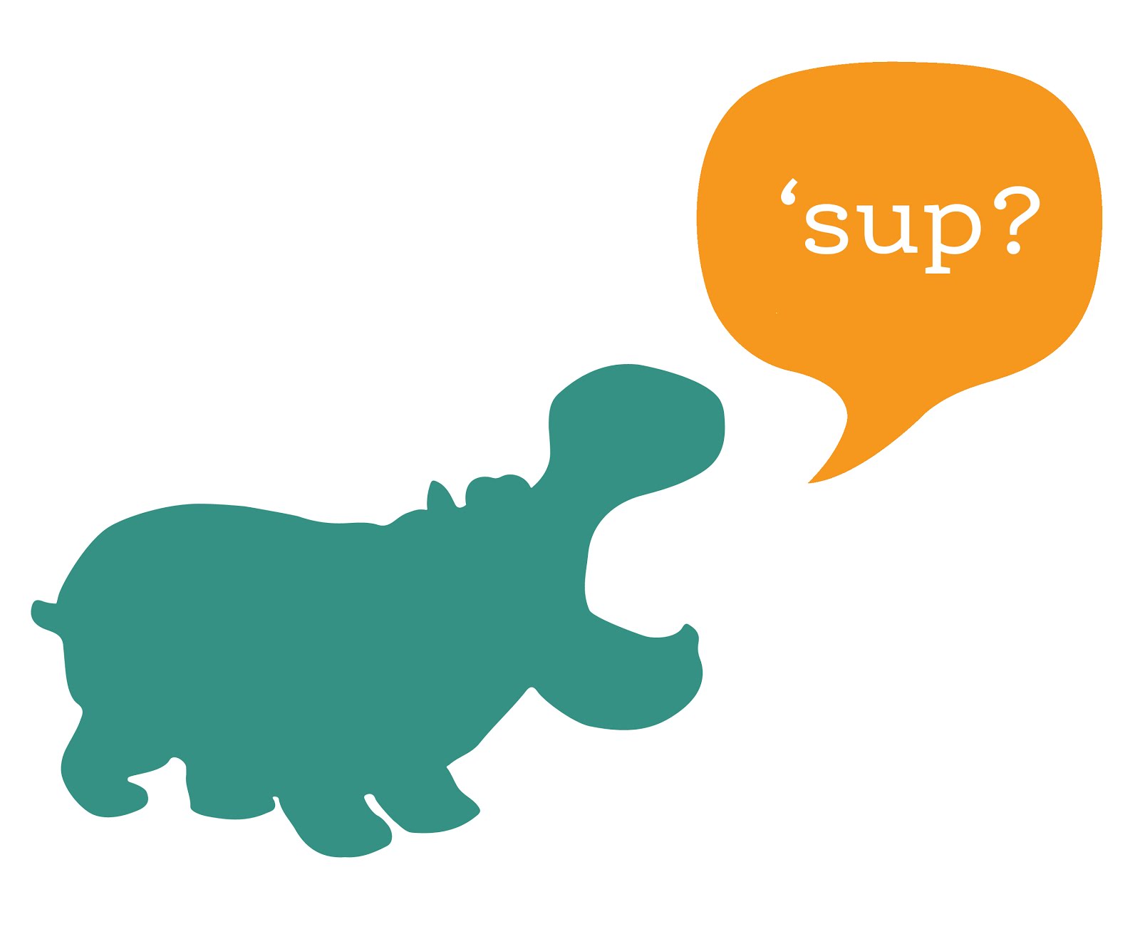
Without all this work on the graphic design – the look and feel that reflected the ethos of the product – the underlying playfulness would have been invisible. This user focus also meant removing internal references and in-jokes that could confuse people, so there are no references to the 'magic moustache machine'. Instead, 'Serendhippo' emerged as a character who guided the user through the site.

moustache.png But how does a magic moustache make a process playful?

magicmoustachediagram.jpgThe moustache was a visible signifier of play. It appeared in the first technical architecture diagram – a refusal to take our situation too seriously was embedded at the heart of the project. This sketch also shows the value of having a shared physical or visual reference – outlining the core technical structure gave people a shared sense of how different aspects of their work would contribute to the whole. After all, if there aren't any structure or rules, it isn't a game.

This playfulness meant that writing code (in a new language, under pressure) could then be about making the machine more magic, not about ticking off functions on a specification document. The framing of the week as a challenge and as a learning experience allowed a lack of knowledge or the need to learn new skills to be a challenge, rather than a barrier. My role was to provide just enough structure to let the development team concentrate on the task at hand.

In a way, I performed the role of old-fashioned games master, defining the technical constraints and boundaries much as someone would police the rules of a game. Previous experience with cultural heritage APIs meant I was able to make decisions quickly rather than letting indecision or doubt become a barrier to progress. Just as games often reduce complex situations to smaller, simpler versions, reducing the complexity of problems created a game-like environment.

UX matters


Ultimately, a focus on the end user experience drove all the decisions about the backend functionality, the graphic design and micro-copy and how the site responded to the user.

It's easy to forget that every pixel, line of code or text is there either through positive decisions or decisions not consciously taken. User experience design processes usually involve lots of conversation, questions, analysis, more questions, but at OWOT we didn't have that time, so the trust we placed in each other to make good decisions and in the playful vision for Serendipomatic created space for us to focus on creating a good user experience. The whole team worked hard to make sure every aspect of the design helps people on the site understand our vision so they can get with exploring and enjoying Serendipomatic.

Some possible real-life lessons I didn't include in the paper

One Week One Tool was an artificial environment, but here are some thoughts on lessons that could be applied to other projects:

  • Conversations trump specifications and showing trumps telling; use any means you can to make sure you're all talking about the same thing. Find ways to create a shared vision for your project, whether on mood boards, technical diagrams, user stories, imaginary product boxes. 
  • Find ways to remind yourself of the real users your product will delight and let empathy for them guide your decisions. It doesn't matter how much you love your content or project, you're only doing right by it if other people encounter it in ways that make sense to them so they can love it too (there's a lot of UXy work on 'on-boarding' out there to help with this). User-centred design means understanding where users are coming from, not designing based on popular opinion.you can use tools like customer journey maps to understand the whole cycle of people finding their way to and using your site (I guess I did this and various other UXy methods without articulating them at the time). 
  • Document decisions and take screenshots as you go so that you've got a history of your project – some of this can be done by archiving task lists and user stories. 
  • Having someone who really understands the types of audiences, tools and materials you're working with helps – if you can't get that on your team, find others to ask for feedback – they may be able to save you lots of time and pain.
  • Design and UX resources really do make a difference, and it's even better if those skills are available throughout the agile development process.

So we made a thing. Announcing Serendip-o-matic at One Week, One Tool

So we made a thing. And (we think) it's kinda cool! Announcing Serendip-o-matic http://t.co/mQsHLqf4oX #OWOT
— Mia (@mia_out) August 2, 2013

Source code at GitHub Serendipomatic – go add your API so people can find your stuff! Check out the site at serendipomatic.org.

Update: and already we've had feedback that people love the experience and have found it useful – it's so amazing to hear this, thank you all! We know it's far from perfect, but since the aim was to make something people would use, it's great to know we've managed that:

Congratulations @mia_out and the team of #OWOT for http://t.co/cNbCbEKlUf Already try it & got new sources about a Portuguese King. GREAT!!!
— Daniel Alves (@DanielAlvesFCSH) August 2, 2013

Update from Saturday morning – so this happened overnight:

Cool, Serendipmatic cloned and local dev version up and running in about 15 mins. Now to see about adding Trove to the mix. #owot
— Tim Sherratt (@wragge) August 3, 2013

And then this:

Just pushed out an update to http://t.co/uM13iWLISU — now includes Trove content! #owot
— RebeccaSuttonKoeser (@suttonkoeser) August 3, 2013

From the press release: One Week | One Tool Team Launches Serendip-o-matic

serendip-o-maticAfter five days and nights of intense collaboration, the One Week | One Tool digital humanities team has unveiled its web application: Serendip-o-matic <http://serendipomatic.org>. Unlike conventional search tools, this “serendipity engine” takes in any text, such as an article, song lyrics, or a bibliography. It then extracts key terms, delivering similar results from the vast online collections of the Digital Public Library of America, Europeana, and Flickr Commons. Because Serendip-o-matic asks sources to speak for themselves, users can step back and discover connections they never knew existed. The team worked to re-create that moment when a friend recommends an amazing book, or a librarian suggests a new source. It’s not search, it’s serendipity.

Serendip-o-matic works for many different users. Students looking for inspiration can use one source as a springboard to a variety of others. Scholars can pump in their bibliographies to help enliven their current research or to get ideas for a new project. Bloggers can find open access images to illustrate their posts. Librarians and museum professionals can discover a wide range of items from other institutions and build bridges that make their collections more accessible. In addition, millions of users of RRCHNM’s Zotero can easily run their personal libraries through Serendip-o-matic.
Serendip-o-matic is easy to use and freely available to the public. Software developers may expand and improve the open-source code, available on GitHub. The One Week | One Tool team has also prepared ways for additional archives, libraries, and museums to make their collections available to Serendip-o-matic. 

Highs and lows, day four of OWOT

If you'd asked me at 6pm, I would have said I'd have been way too tired to blog later, but it also felt like a shame to break my streak at this point. Today was hard work and really tiring – lots to do, lots of finicky tech issues to deal with, some tricky moments to work through – but particularly after regrouping back at the hotel, the dev/design team powered through some of the issues we'd butted heads against earlier and got some great work done.  Tomorrow will undoubtedly be stressful and I'll probably triage tasks like mad but I think we'll have something good to show you.

As I left the hotel this morning I realised an intense process like this isn't just about rapid prototyping – it's also about rapid trust. When there's too much to do and barely any time for communication, let alone  checking someone else's work, you just have to rely on others to get the bits they're doing right and rely on goodwill to guide the conversation if you need to tweak things a bit.  It can be tricky when you're working out where everyone's sense of boundaries between different areas are as you go, but being able to trust people in that way is a brilliant feeling. At the end of a long day, I've realised it's also very much about deciding which issues you're willing to spend time finessing and when you're happy to hand over to others or aim for a first draft that's good enough to go out with the intention to tweak if it you ever get time. I'd asked in the past whether a museum's obsession with polish hinders innovation so I can really appreciate how freeing it can be to work in an environment where to get a product that works, let alone something really good, out in the time available is a major achievement.

Anyway, enough talking. Amrys has posted about today already, and I expect that Jack or Brian probably will too, so I'm going to hand over to some tweets and images to give you a sense of my day. (I've barely had any time to talk to or get to know the Outreach team so ironically reading their posts has been a lovely way to check in with how they're doing.)

Our GitHub repository punch card report tells the whole story of this week – from nothing to huge levels of activity on the app code

I keep looking at the #OWOT commits and clapping my hands excitedly. I am a great. big. dork.
— Mia (@mia_out) August 1, 2013

OH at #owot 'I just had to get the hippo out of my system' (More seriously, so exciting to see the design work that's coming out!)
— Mia (@mia_out) August 1, 2013

OH at #OWOT 'I'm not sure JK Rowling approves of me'. Also, an earlier unrelated small round of applause. Progress is being made.
— Mia (@mia_out) August 1, 2013

#OWOT #owotleaks it turns out our mysterious thing works quite well with song lyrics.
— Mia (@mia_out) August 1, 2013

Halfway through. Day three of OWOT.

Crikey. Day three. Where do I start?

We've made great progress on our mysterious tool. And it has a name! Some cool design motifs are flowing from that, which in turn means we can really push the user experience design issues over the next day and a half (though we've already been making lots of design decisions on the hoof so we can keep dev moving). The Outreach team have also been doing some great communications work, including a Press Release and have lots more in the pipeline. The Dev/Design team did a demo of our work for the Outreach team before dinner – there are lots of little things but the general framework of the tool works as it should – it's amazing how far we've come since lunchtime yesterday.  We still need to do a full deployment (server issues, blah blah), and I'll feel a lot better when we've got that process working and then running smoothly, so that we can keep deploying as we finish major features up to a few hours before launch rather than doing it at the end in a mad panic. I don't know how people managed code before source control – not only does Github manage versions for it, it makes pulling in code from different people so much easier.

There's lots to tackle on many different fronts, and it may still end up in a mad rush at the end, but right now, the Dev/Design team is humming along. I've been so impressed with the way people have coped with some pretty intense requirements for working with unfamiliar languages or frameworks, and with high levels of uncertainty in a chaotic environment.  I'm trying to keep track of things in Github (with Meghan and Brian as brilliant 'got my back' PMs) and keep the key current tasks on a whiteboard so that people know exactly what they need to be getting done at any time. Now that the Outreach team have worked through the key descriptive texts, name and tagline we'll need to coordinate content production – particularly documentation, microcopy to guide people through the process – really closely, which will probably get tricky as time is short and our tasks are many, but given the people gathered together for OWOT, I have faith that we'll make it work.


Things I have learnt today: despite two years working on a PhD in digital humanities/digital history, I still have a brain full of technical stuff – it's a relief to realise it hasn't atrophied through lack of use. I've also realised how much the work I've done designing workshops and teaching since starting my PhD have fed into how I work with teams, though it's hard right now to quantify exactly *how*. Finally, it's re-affirmed just how much I like making things – but also that it's important to make those things in the company of people who are scholarly (or at least thoughtful) about subjects beyond tech and inter-disciplinary, and ideally to make things that engage the public as well as researchers. As the end of my PhD approaches, it's been really useful to step back into this world for a week, and I'll definitely draw on it when figuring out what to do after the PhD. If someone could just start a CHNM in the UK, I'd be very happy.

I still can't tell you what we're making, but I *can* tell you that one of these photos in this post contains a clue (and they all definitely have nothing to do with mild lightheadedness at the end of a long day).

And so it begins: day two of OWOT

Day two of One Week, One Tool. We know what we're making, but we're not yet revealing exactly what it is. (Is that mean? It's partly a way of us keeping things simple so we can focus on work.) Yesterday (see Working out what we're doing: day one of One Week, One Tool) already feels like weeks ago, and even this morning feels like a long time ago. I can see that my posts are going to get less articulate as the week goes on, assuming I keep posting. I'm not sure how much value this will have, but I suppose it's a record of how fast you can move in the right circumstances…

We spent the morning winnowing the ideas we'd put up for feedback on overnight down from c12 to 4, then 3, then 2, then… It's really hard killing your darlings, and it's also difficult choosing between ideas that sound equally challenging or fun or worthy. There was a moment when we literally wiped ideas that had been ruled out from the whiteboard, and it felt oddly momentous. In the end, the two final choices both felt like approaches to the same thing – perhaps because we'd talked about them for so long that they started to merge (consciously or not) or because they both fell into a sweet spot of being accessible to a wide audience and had something to do with discovering new things about your research (which was the last thing I tweeted before we made our decision and decided to keep things in-house for a while).  Finally, eventually, we had enough of a critical mass behind one idea to call it the winner.

Personally, our decision only started to feel real as we walked back from lunch – our task was about to get real.  It's daunting but exciting. Once back in the room, we discussed the chosen idea a bit more and I got a bit UX/analysty and sketched stuff on a whiteboard. I'm always a bit obsessed with sketching as a way to make sure everyone has a more concrete picture (or shared mental model) of what the group is talking about, and for me it also served as a quick test of the technical viability of the idea. CHNM's Tom Scheinfeldt then had the unenviable task of corralling/coaxing/guiding us into project management, dev/design and outreach teams. Meghan Frazer and Brian Croxall are project managing, I'm dev/design team lead, with Scott Kleinman, Rebecca Sutton Koeser, Amy Papaelias, Eli Rose, Amanda Visconti and Scott Williams (and in the hours since then I have discovered that they all rock and bring great skills to the mix), and Jack Dougherty is leading the outreach team of Ray Palin and Amrys Williams in their tasks of marketing, community development, project outreach, grant writing, documentation. Amrys and Ray are also acting as user advocates and they've all contributed user stories to help us clarify our goals. Lots of people will be floating between teams, chipping in where needed and helping manage communication between teams.

The Dev/Design team began with a skills audit so that we could figure out who could do what on the front- and back-end, which in turn fed into our platform decision (basically PHP or Python, Python won), then a quick list of initial tasks that would act as further reality checks on the tool and our platform choice. The team is generally working in pairs on parallel tasks so that we're always moving forward on the three main functional areas of the tool and to make merging updates on github simpler. We're also using existing JavaScript libraries and CSS grids to make the design process faster. I then popped over to the Outreach team to check in with the descriptions and potential user stories they were discussing. Meghan and Brian got everyone back together at the end of the day, and the dev/design team had a chance to feed back on the outreach team's work (which also provided a very ad hoc form of requirements elicitation but it started some important conversations that further shaped the tool). Then it was back over to the hotel lobby where we planned to have a dev/design team meeting before dinner, but when two of our team were kidnapped by a shuttle driver (well, sorta) we ended up working through some of the tasks for tomorrow. We're going to have agile-style stand-up meetings twice a day, with the aim to give people enough time to get stuck into tasks while still keeping an eye on progress with a forum to help deal with any barriers or issues. Some ideas will inevitably fall by the wayside, but because the OWOT project is designed to run over a year, we can put ideas on a wishlist for future funded development, leave as hooks for other developers to expand on, or revisit once we're back home. In hack day mode I tend to plan so that there's enough working code that you have something to launch, then go back and expand features in the code and polish the UX with any time left. Is this the right approach here? Time will tell.

#owot dev team is hard at work. #fb pic.twitter.com/Zj5PW0Kj2a
— Brian Croxall (@briancroxall) July 31, 2013

Designing for participatory projects: emergent best practice, getting discussion started

I was invited over to New Zealand (from Australia) recently to talk at Te Papa in Wellington and the Auckland Museum.  After the talks I was asked if I could share some of my notes on design for participatory projects and for planning for the impact of participatory projects on museums.  Each museum has a copy of my slides, but I thought I'd share the final points here rather than by email, and take the opportunity to share some possible workshop activities to help museums plan audience participation around its core goals.

Both talks started by problematising the definition of a 'museum website' – it doesn't work to think of your 'museum website' as purely stuff that lives under your domain name when it's now it's also the social media accounts under your brand, your games and mobile apps, and maybe also your objects and content on Google Art Project or even your content in a student’s Tumblr.  The talks were written to respond to the particular context of each museum so they varied from there, but each ended up with these points.  The sharp-eyed among you might notice that they're a continuation of ideas I first shared in my Europeana Tech keynote: Open for engagement: GLAM audiences and digital participation.  The second set are particularly aimed at helping museums think about how to market participatory projects and sustain them over the longer term by making them more visible in the museum as a whole.

Best practice in participatory project design

  • Have an answer to 'Why would someone spend precious time on your project?'
  • Be inspired by things people love
  • Design for the audience you want
  • Make it a joy to participate
  • Don't add unnecessary friction, barriers (e.g. don't add sign-up forms if you don’t really need them, or try using lazy registration if you really must make users create accounts)
  • Show how much you value contributions (don't just tell people you value their work)
  • Validate procrastination – offer the opportunity to make a difference by providing meaningful work
  • Provide an easy start and scaffolded tasks (see e.g. Nina Simon's Self-Expression is Overrated: Better Constraints Make Better Participatory Experiences)
  • Let audiences help manage problems – let them know which behaviours are acceptable and empower them to keep the place tidy
  • Test with users; iterate; polish

Best practice within your museum

  • Fish where the fish are – find the spaces where people are already engaging with similar content and see how you can slot in, don't expect people to find their way to you unless you have something they can’t find anywhere else
  • Allow for community management resources – you’ll need some outreach to existing online and offline communities to encourage participation, some moderation and just a general sense that the site hasn’t been abandoned. If you can’t provide this for the life of the project, you might need to question why you’re doing it.
  • Decide where it's ok to lose control. Try letting go… you may find audiences you didn't expect, or people may make use of your content in ways you never imagined. Watch and learn and tweak in response – this is a good reason to design in iterations, and to go into public or invited-beta earlier rather than later. 
  • Realistically assess fears, decide acceptable levels of risk. Usually fears can be turned into design requirements, they’re rarely show-stoppers.
  • Have a clear objective, ideally tied to your museum’s mission. Make sure the point of the project is also clear to your audience.
  • Put the audience needs first. You’re asking people to give up their time and life experience, so make sure the experience respects this. Think carefully before sacrificing engagement to gain efficiency.
  • Know how to measure success
  • Plan to make the online activity visible in the organisation and in the museum. Displaying online content in the museum is a great way to show how much you value it, as well as marketing the project to potential contributors.  Working out how you can share the results with the rest of the organization helps everyone understand how much potential there is, and helps make online visitors ‘real’.
  • Have an exit strategy – staff leave, services fold or change their T&Cs

I'd love to know what you think – what have I missed?  [Update: for some useful background on the organisational challenges many museums face when engaging with technology, check out Collections Access and the use of Digital Technology (pdf).]

More on designing museum projects for audience participation

I prepared this activity for one of the museums, but on the day the discussion after my talk went on so long that we didn't need to use a formal structure to get people talking. In the spirit of openness, I thought I'd share it. If you try it in your organisation, let me know how it goes!

The structure – exploratory idea generation followed by convergence and verification – was loosely based on the 'creativity workshops' developed by City University's Centre for Creativity (e.g. the RESCUE creativity workshops discussed in Use and Influence of Creative Ideas and Requirements for a Work-Integrated Learning System).  It's designed to be a hackday-like creative activity for non-programmers.

In small groups…

  • Pick two strategic priorities or organisational goals…
  • In 5 minutes: generate as many ideas as possible
  • In 2 minutes: pick one idea to develop further

Ideas can include in-gallery and in-person activity; they must include at least two departments and some digital component.

Developing your idea…
Ideas can include in-gallery and in-person activity; they must include at least two departments

  • You have x minutes to develop your idea
  • You have 2 minutes each to report back. Include: which previous museum projects provide relevant lessons? How will you market it? How will it change the lives of its target audience? How will it change the museum?
  • How will you alleviate potential risks?  How will you maximise potential benefits?
  • You have x minutes for general discussion. How can you build on the ideas you've heard?

For bonus points…

These discussion points were written for another museum, but they might be useful for other organisations thinking about audience participation and online collections:

What are the museum’s goals in engaging audiences with collections online?

  • What does success look like?
  • How will it change the museum?
  • Which past projects provide useful lessons?

How can the whole organisation be involved in supporting online conversations?

  • What are the barriers?
  • What small, sustainable steps can be taken?
  • Where are online contributions visible in the museum?

Museums and iterative agility: do your ideas get oxygen?

Re-visiting the results of the survey I ran about issues facing museum technologists has inspired me to gather together some great pieces I've read on museum projects moving away from detailed up-front briefs and specifications toward iterative and/or agile development.

In 'WaterWorx – our first in-gallery iPad interactive at the Powerhouse Museum', Seb Chan writes:

"the process by which this game was developed was in itself very different for us. … Rather than an explicit and ‘completed’ brief be given to Digital Eskimo, the game developed using an iterative and agile methodology, begun by a process that they call ‘considered design‘. This brought together stakeholders and potential users all the way through the development process with ‘real working prototypes’ being delivered along the way – something which is pretty common for how websites and web applications are made, but is still unfortunately not common practice for exhibition development."

I'd also recommend the presentation 'Play at Work: Applying Agile Methods to Museum Website Development' given at the 2010 Museum Computer Network Conference by Dana Mitroff Silvers and Alon Salant for examples of how user stories were used to identify requirements and prioritise development, and for an insight into how games can be used to get everyone working in an agile way.  If their presentation inspires you, you can find games you can play with people to help everyone understand various agile, scrum and other project management techniques and approaches at tastycupcakes.com.

I'm really excited by these examples, as I'm probably not alone in worrying about the mis-match between industry-standard technology project management methods and museum processes. In a 'lunchtime manifesto' written in early 2009, I hoped the sector would be able to 'figure out agile project structures that funders and bid writers can also understand and buy into' – maybe we're finally at that point.

And from outside the museum sector, a view on why up-front briefs don't work for projects that where user experience design is important.  Peter Merholz of Adaptive Path writes:

"1. The nature of the user experience problems are typically too complex and nuanced to be articulated explicitly in a brief. Because of that, good user experience work requires ongoing collaboration with the client. Ideally, client and agency basically work as one big team.

2. Unlike the marketing communications that ad agencies develop, user experience solutions will need to live on, and evolve, within the clients’ business. If you haven’t deeply involved the client throughout your process, there is a high likelihood that the client will be unable to maintain whatever you produce."

Finally, a challenge to the perfectionism of museums.  Matt Mullenweg (of WordPress fame), writes in '1.0 Is the Loneliest Number': 'if you’re not embarrassed when you ship your first version you waited too long'.  Ok, so that might be a bit difficult for museums to cope with, but what if it was ok to release your beta websites to the public?  Mullenweg makes a strong case for iterating in public:

"Usage is like oxygen for ideas. You can never fully anticipate how an audience is going to react to something you’ve created until it’s out there. That means every moment you’re working on something without it being in the public it’s actually dying, deprived of the oxygen of the real world.

By shipping early and often you have the unique competitive advantage of hearing from real people what they think of your work, which in best case helps you anticipate market direction, and in worst case gives you a few people rooting for you that you can email when your team pivots to a new idea. Nothing can recreate the crucible of real usage.

You think your business is different, that you’re only going to have one shot at press and everything needs to be perfect for when Techcrunch brings the world to your door. But if you only have one shot at getting an audience, you’re doing it wrong."

* The Merholz article above is great because you can play a fun game with the paragraph below – in your museum, what job titles would you put in place of 'art director' and 'copywriter'?  Answers in a comment, if you dare!  I think it feels particularly relevant because of the number of survey responses that suggested museums still aren't very good at applying the expertise of their museum technologists.

"One thing I haven’t yet touched on is the legacy ad agency practice where the art director and copywriter are the voices that matter, and the rest of the team exists to serve their bidding. This might be fine in communications work, but in user experience, where utility is king, this means that the people who best understand user engagement are often the least empowered to do anything about it, while those who have little true understanding of the medium are put in charge. In user experience, design teams need to recognize that great ideas can come from anywhere, and are not just the purview of a creative director."


If you liked this post, you may also be interested in Confluence on digital channels; technologists and organisational change? (29 September 2012) and A call for agile museum projects (a lunchtime manifesto) (10 March 2009).